micky
wright
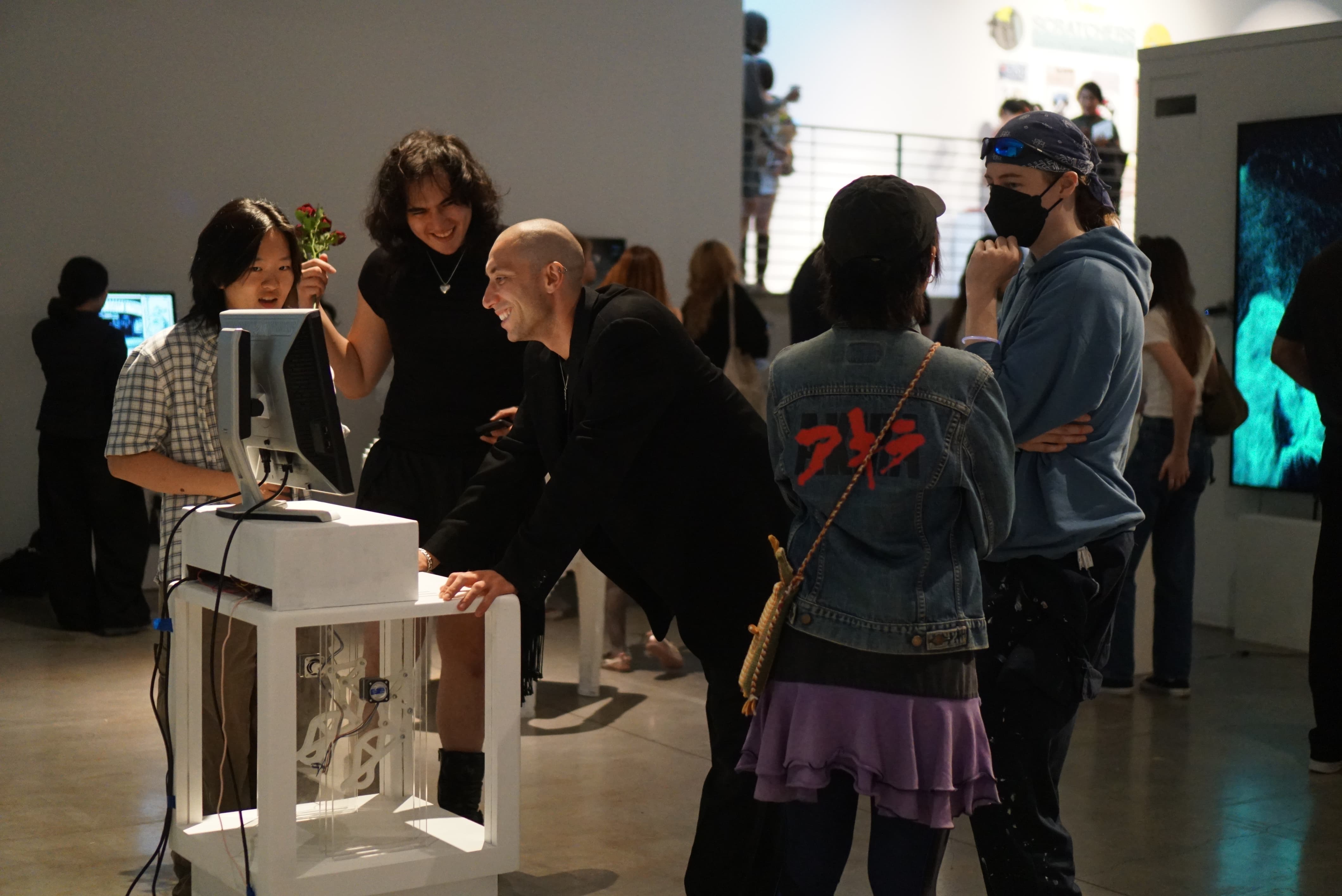
The Tulpabox. Design | Media Arts Capstone Project. June 2026.
Animated, built, coded, and wired by me.
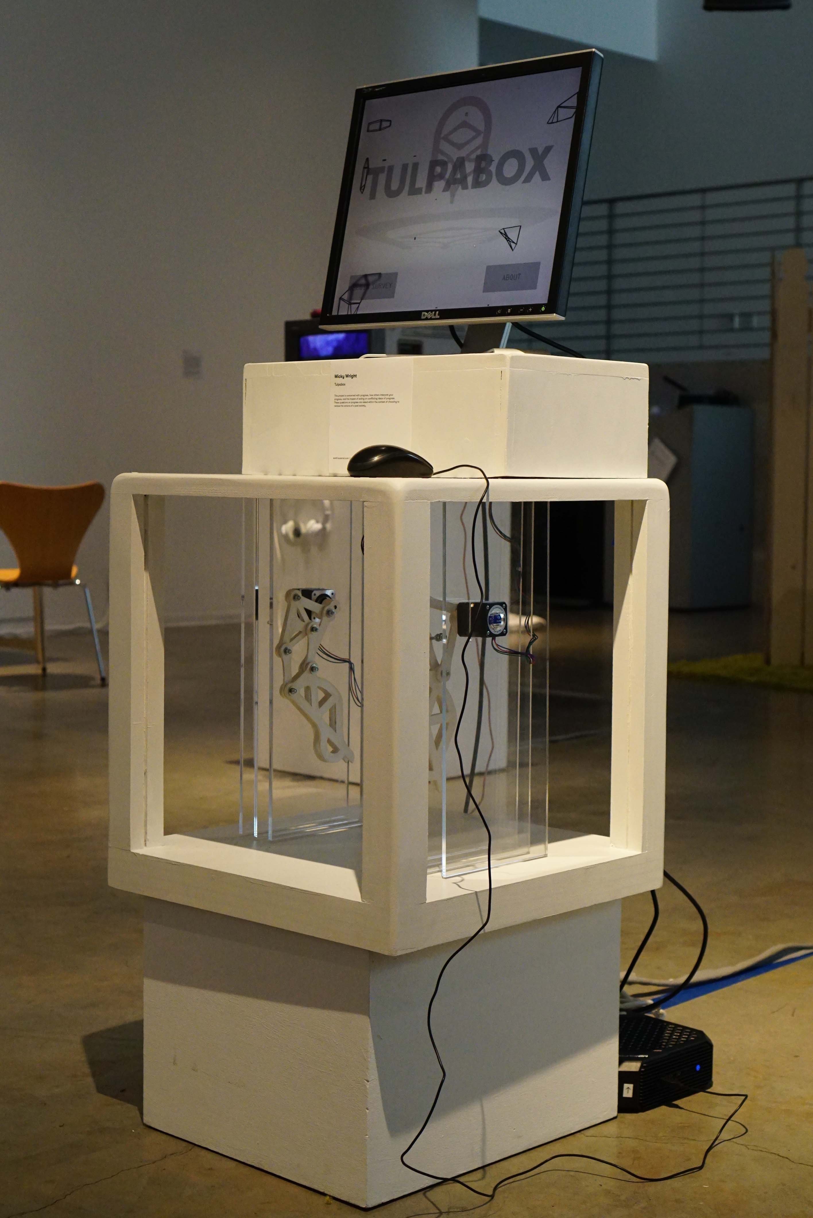
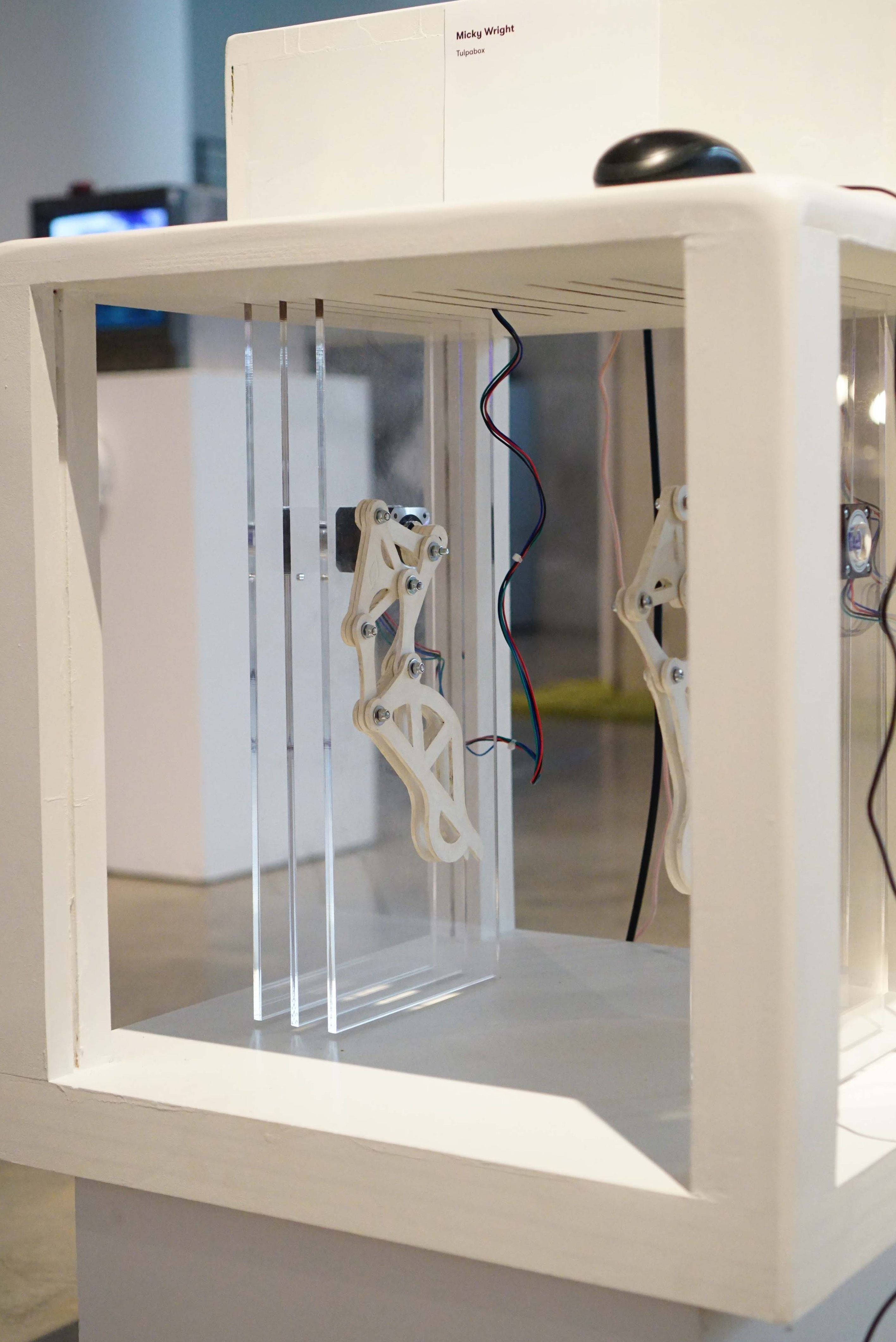
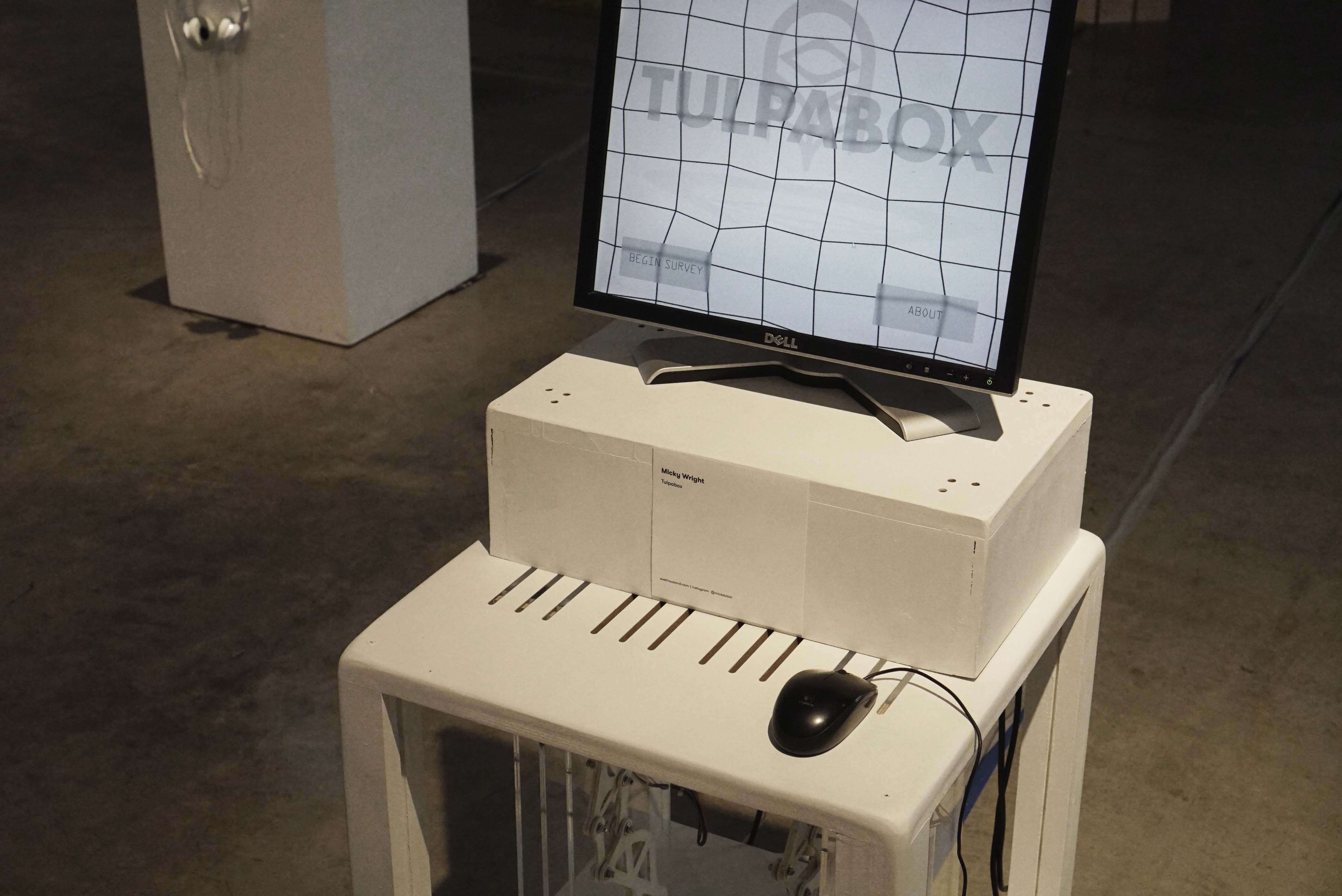
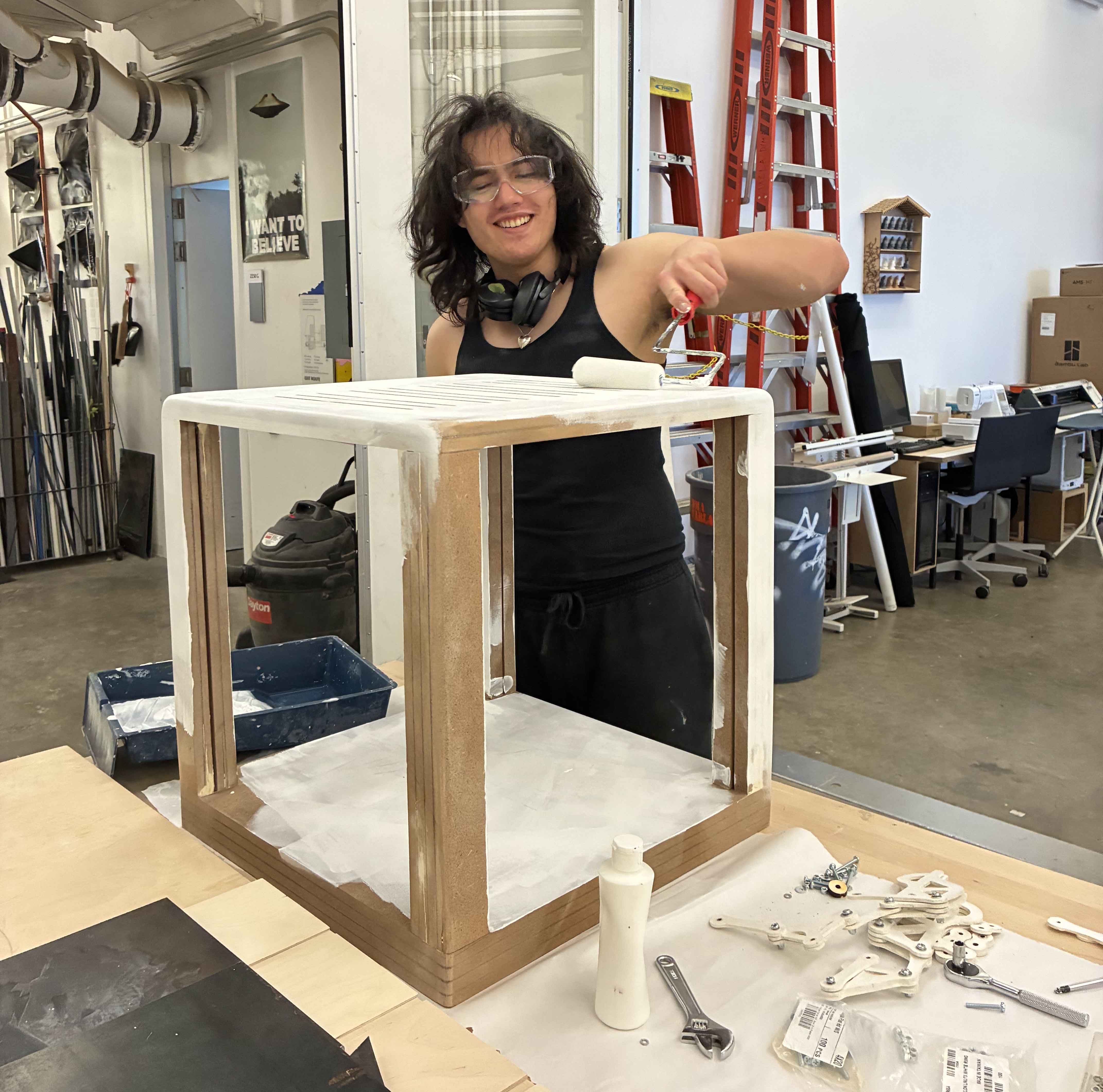
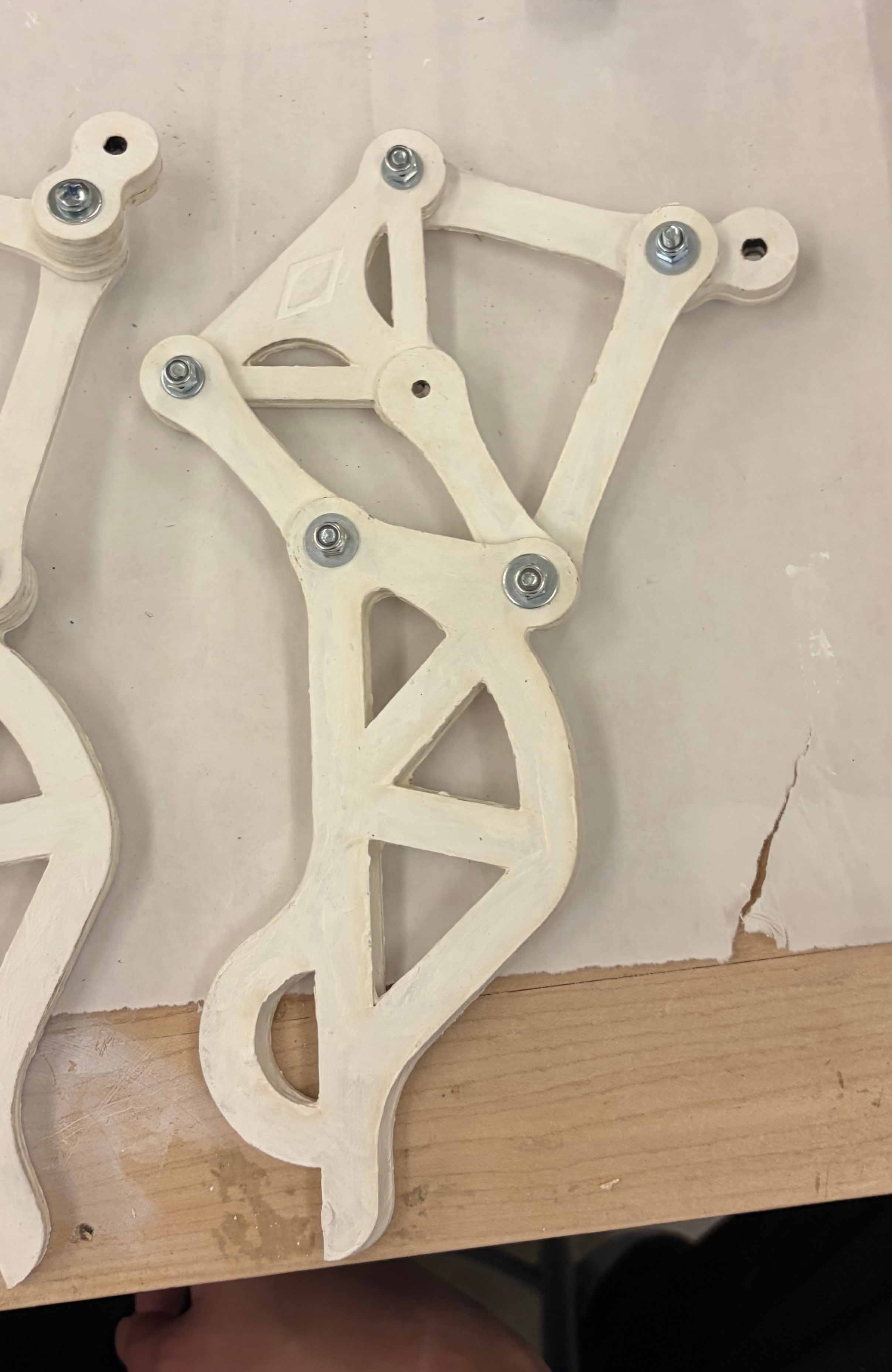
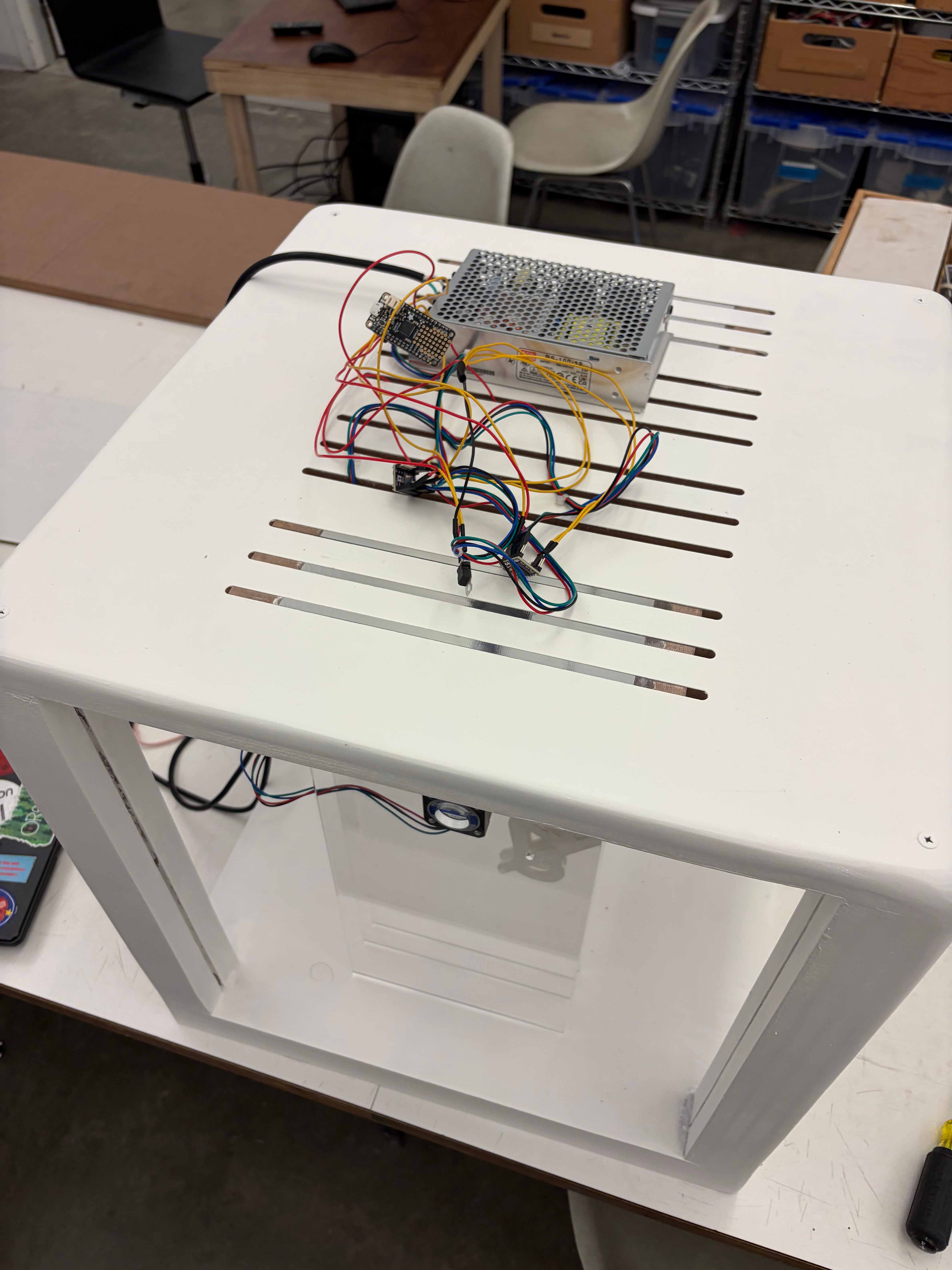
The Tulpabox is built out of layered MDF that has been woodworked and CNCed. The legs, made out of MDF parts screwed together, are moved by NEMA 17 motors that are suspended in between panes of lasercut acrylic. These motors connect to an Adafruit Feather. The Tulpabox's digital interface consists of a survey about your insecurities and concerns. Your answers in this survey (made with HTML, CSS, JS and with Blender-animated backgrounds) generate a code where each digit corresponds to a variable in the movement of the legs. Variables include speed, direction, pause frequency, pause duration, and other behavioral characteristics. In essence, your unique responses create a personalised movement in the machine's legs.
The Tulpabox required me to work with circuitry, fabrication, and visual interfaces at a level that I had not before, pushing my skills across several avenues of design. Because the object's physical vitrine needed to be constructed with specific measurements in mind, I had to approach fabrication carefully and mathematically. The Tulpabox's digital interface was challenging to design, the hardest part being facilitating communication between the chip controlling the legs and the programmed survey. Through countless rounds of iteration, finetuning, and troubleshooting, I was able to bring the Tulpabox to life as an engaging designed object.
I originally designed the Tulpabox to criticise harmful notions of self-critique that are perpetuated by the productivity cultures and aesthetic standards we are subject to. The Tulpabox is a speculative commodity used for therapy, but in its cold simplicity it inspires more inactionable guilt than genuine self reflection.
Animated, built, coded, and wired by me.
The Tulpabox is built out of layered MDF that has been woodworked and CNCed. The legs, made out of MDF parts screwed together, are moved by NEMA 17 motors that are suspended in between panes of lasercut acrylic. These motors connect to an Adafruit Feather. The Tulpabox's digital interface consists of a survey about your insecurities and concerns. Your answers in this survey (made with HTML, CSS, JS and with Blender-animated backgrounds) generate a code where each digit corresponds to a variable in the movement of the legs. Variables include speed, direction, pause frequency, pause duration, and other behavioral characteristics. In essence, your unique responses create a personalised movement in the machine's legs.
The Tulpabox required me to work with circuitry, fabrication, and visual interfaces at a level that I had not before, pushing my skills across several avenues of design. Because the object's physical vitrine needed to be constructed with specific measurements in mind, I had to approach fabrication carefully and mathematically. The Tulpabox's digital interface was challenging to design, the hardest part being facilitating communication between the chip controlling the legs and the programmed survey. Through countless rounds of iteration, finetuning, and troubleshooting, I was able to bring the Tulpabox to life as an engaging designed object.
I originally designed the Tulpabox to criticise harmful notions of self-critique that are perpetuated by the productivity cultures and aesthetic standards we are subject to. The Tulpabox is a speculative commodity used for therapy, but in its cold simplicity it inspires more inactionable guilt than genuine self reflection.
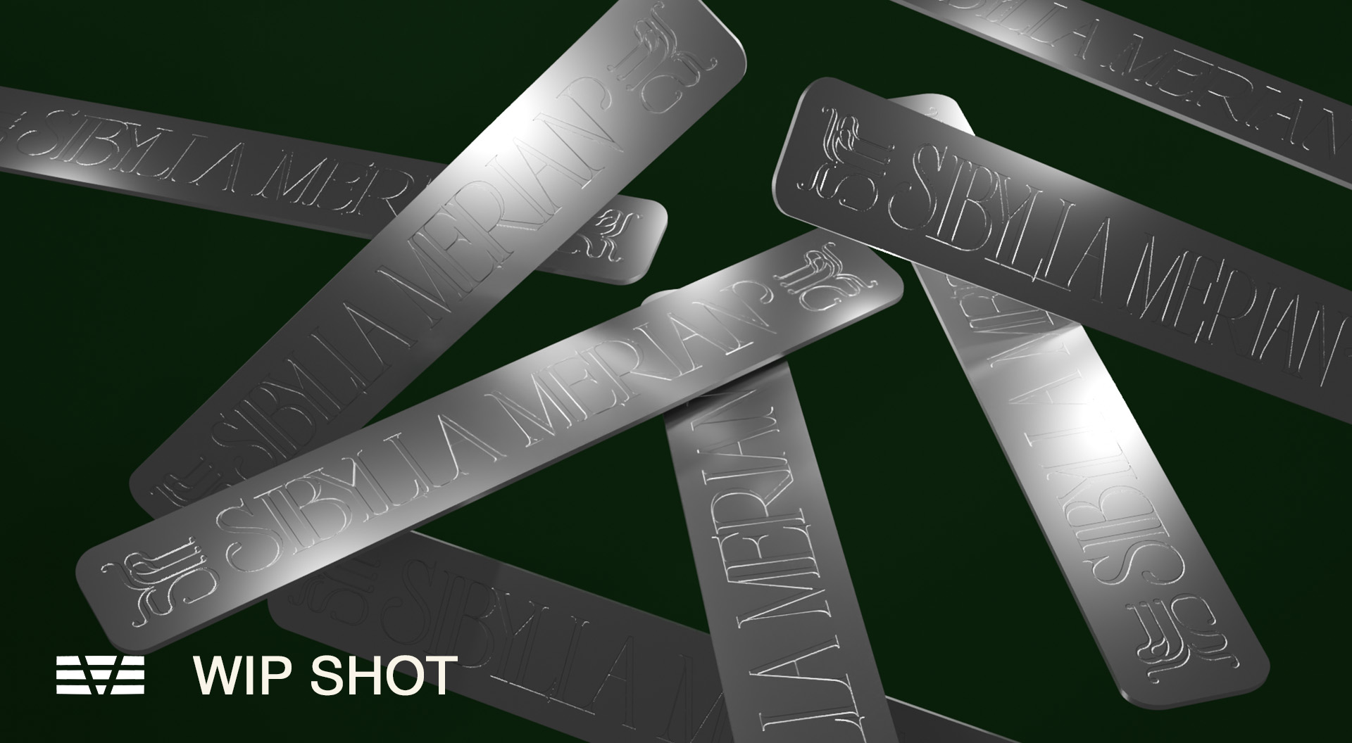
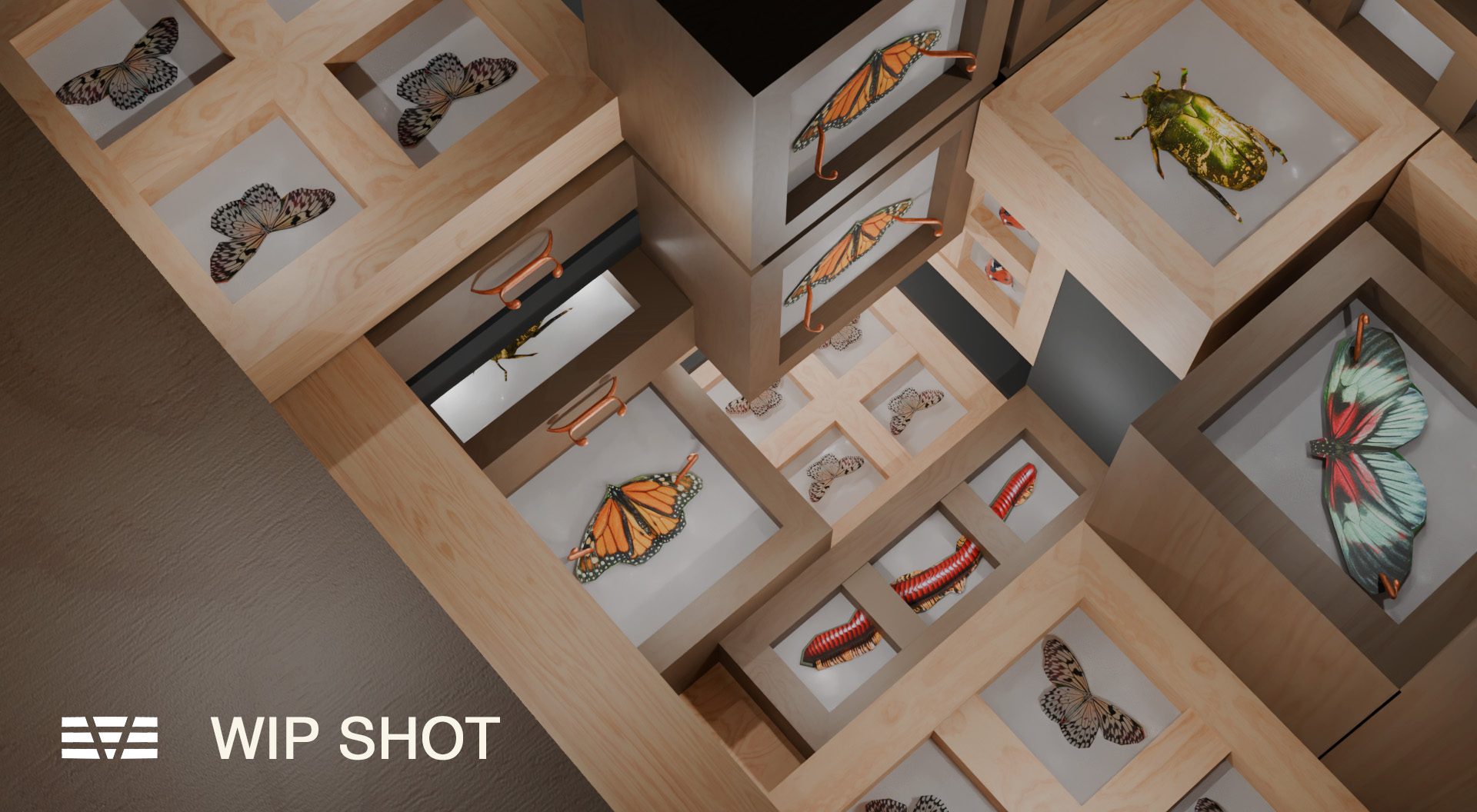
Sibylla Merian Logo / 3D Store Layout Concept. March 2026.
Part of a collaborative exercise in developing a design system for an imaginary brand in DESMA 142 - Design Systems. To see my work alongside my peers' for the full design identity, view our Figma presentation here.
Sibylla Merian, named after the scientist who contributed to our modern understanding of metamorphosis, is a speculative fashion brand for anthropomorphic insects I designed collaboratively with Ash Ericson, August Hattiangadi, Dina Alkhateeb, and Sana Indap. The brand puts forth that there is a natural basis for its garments' superior beauty, incentivising its customers to buy elegant new "exoskeletons" - "the person reading already has the capacity to recognize beauty. They simply need to be shown where to look."
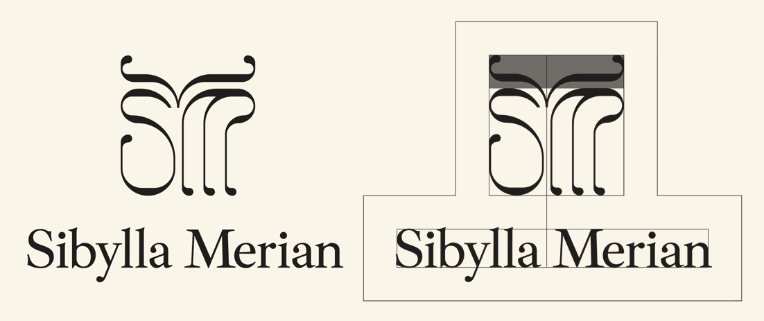
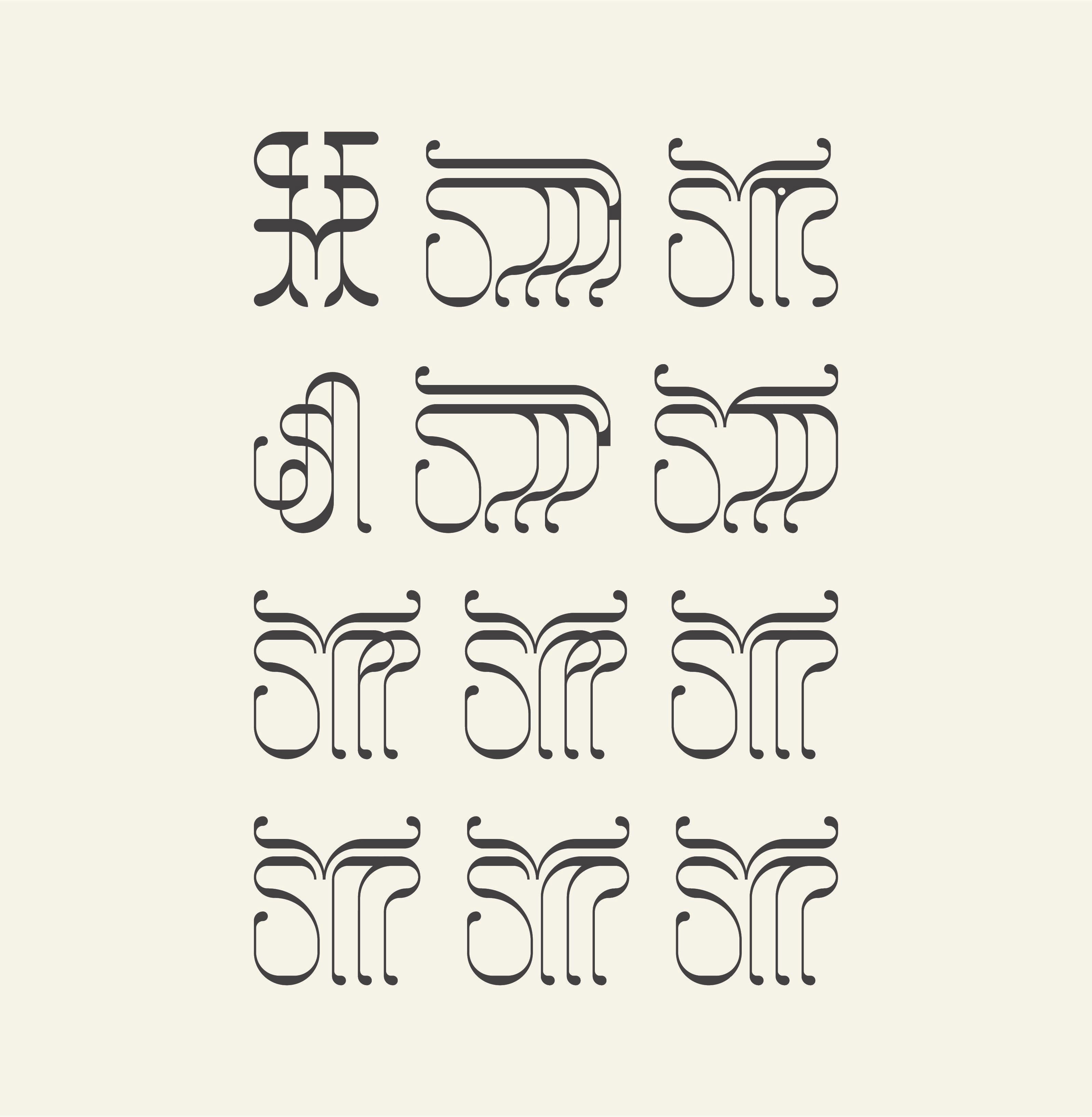
For Sibylla Merian's logo, I sought to capture the quirky yet elegant organicity of the insect form. The thin stems of the M are reminiscent of an insect's legs and taper into the organic bulbs that are repeated as a serif and on the ends of the ornamental antenna shape surmounting the letterforms. The logo's shapes are constructed primarily to register as a butterfly-like abstraction, open-ended enough to read as a variety of poses. Only under sustained observation should the letterforms become clear.
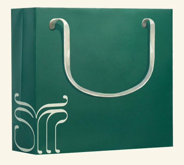
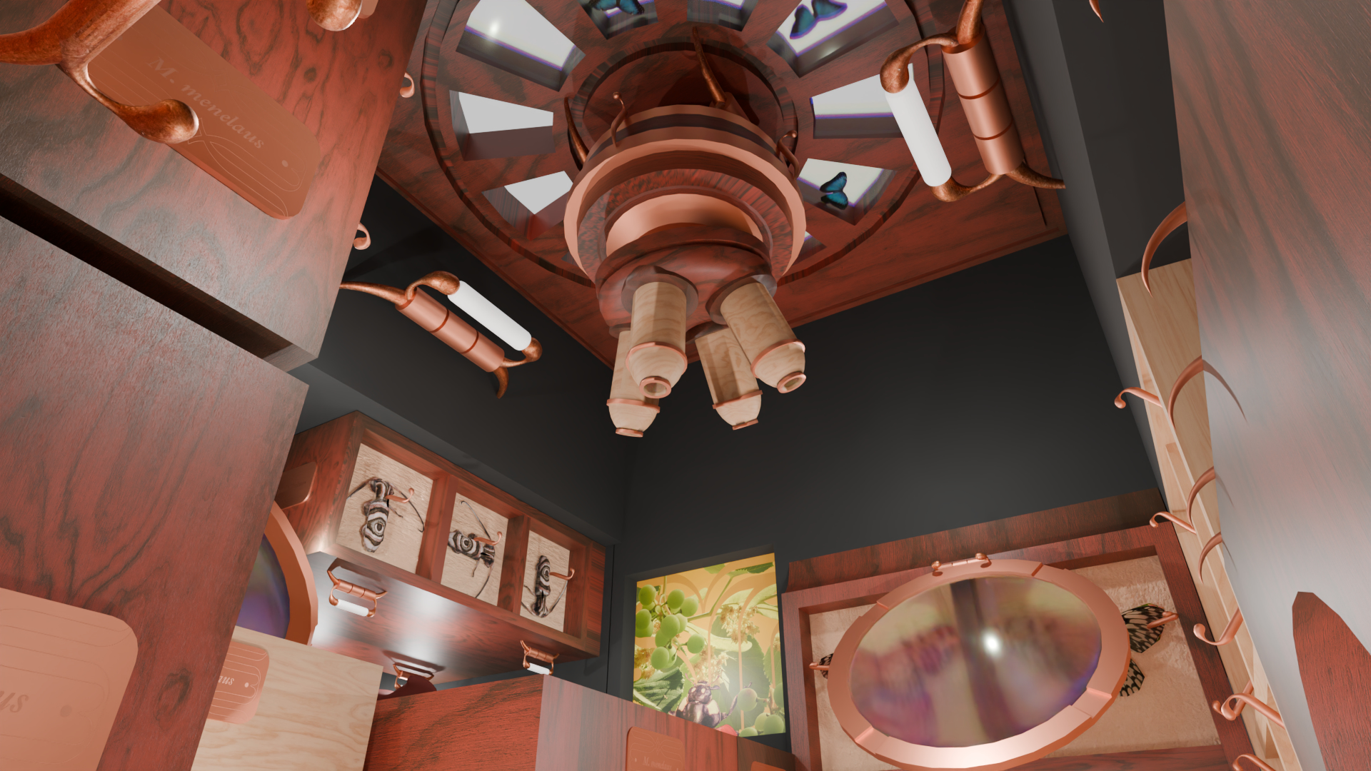
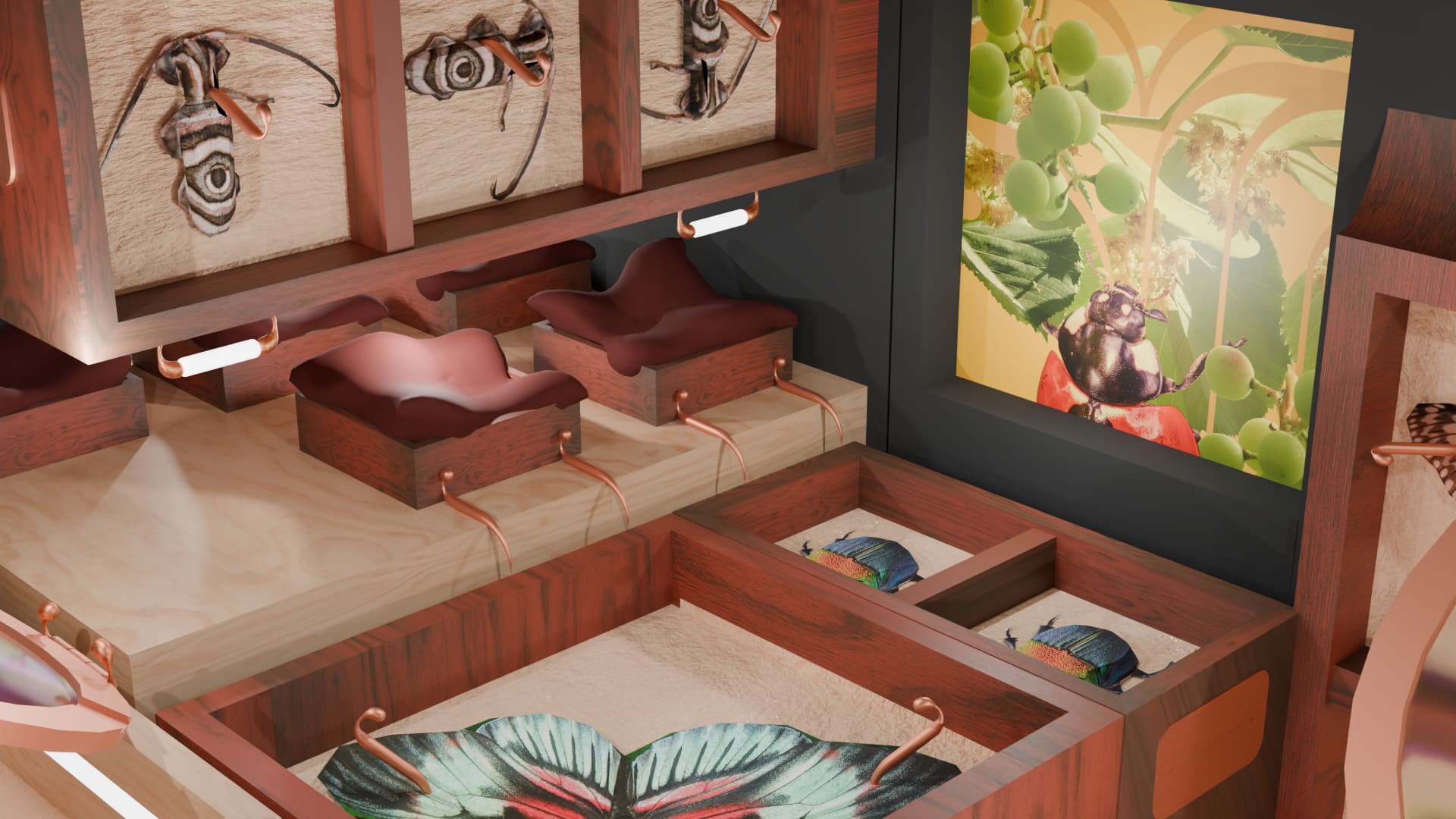
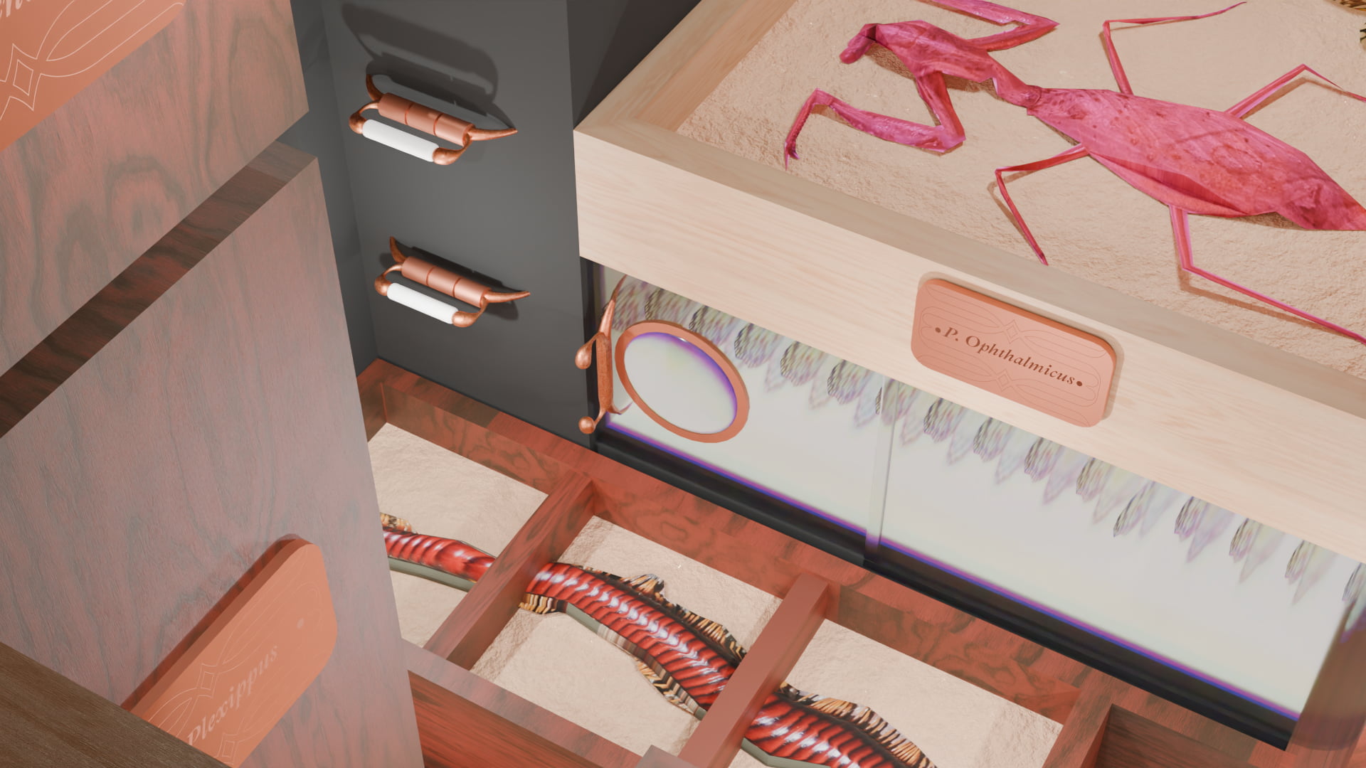
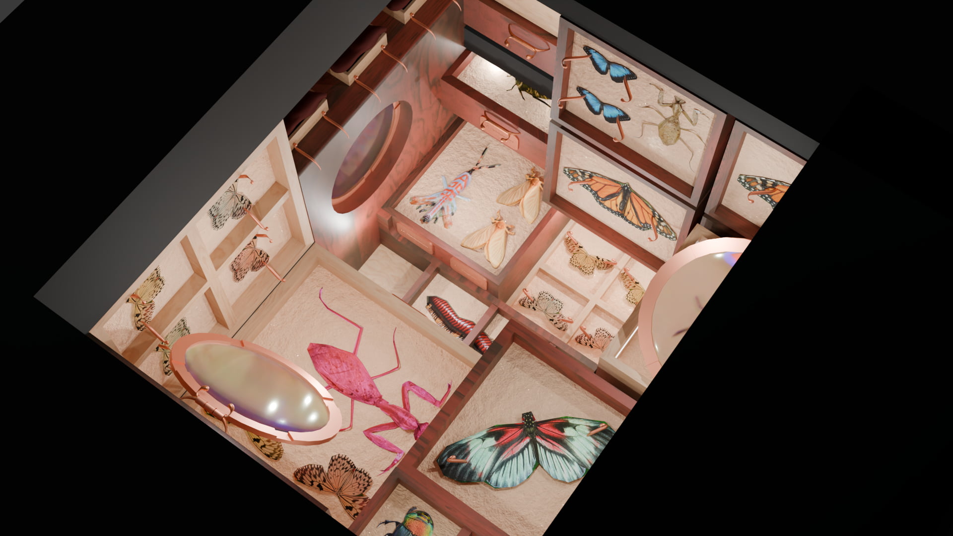
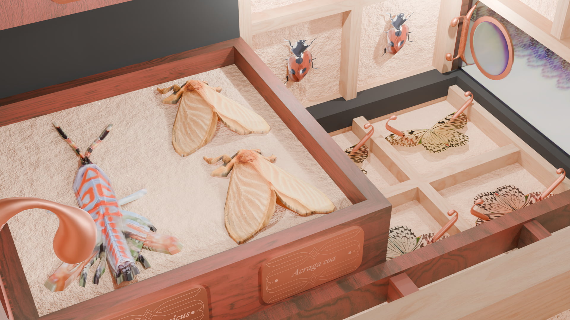
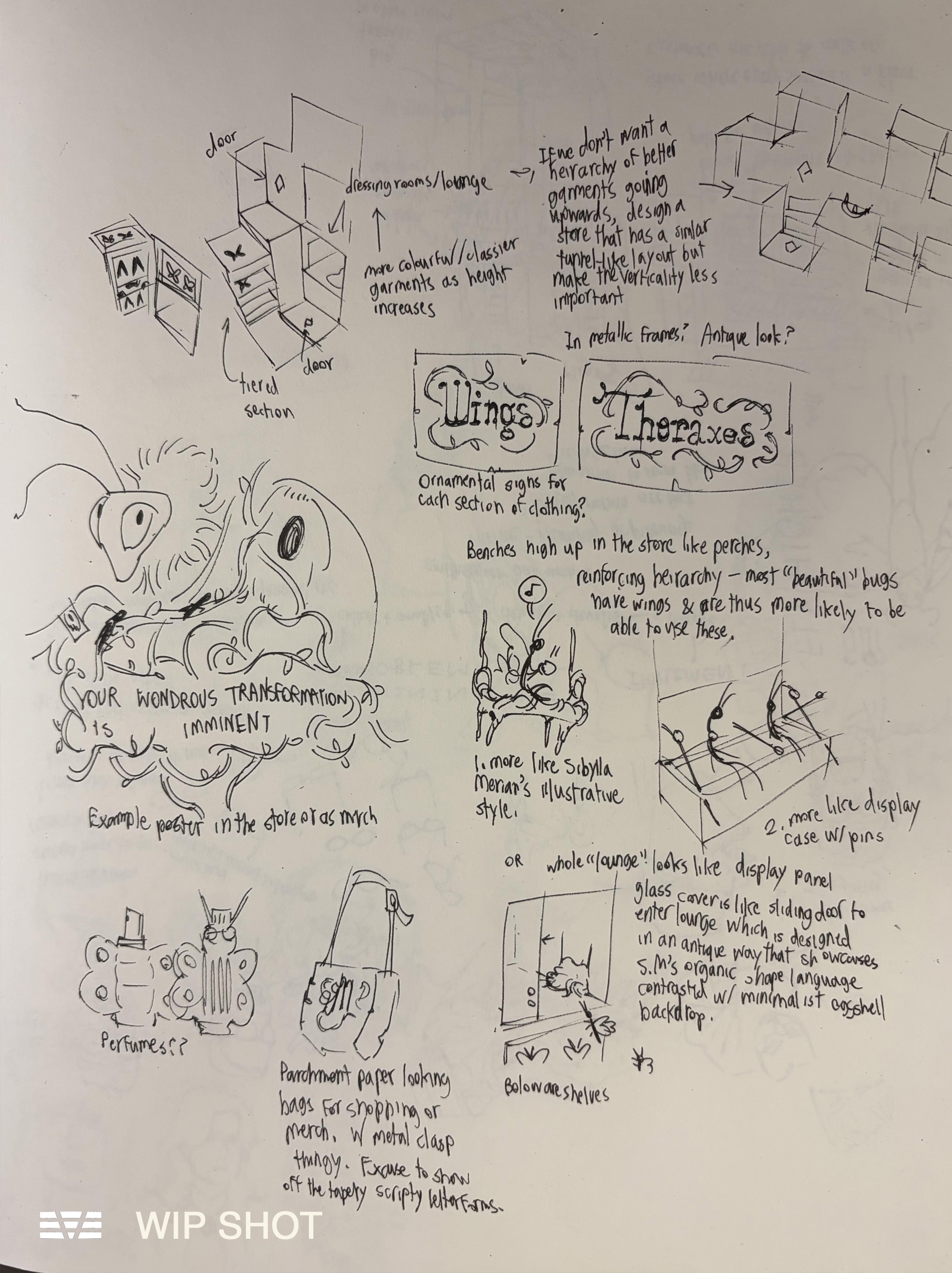
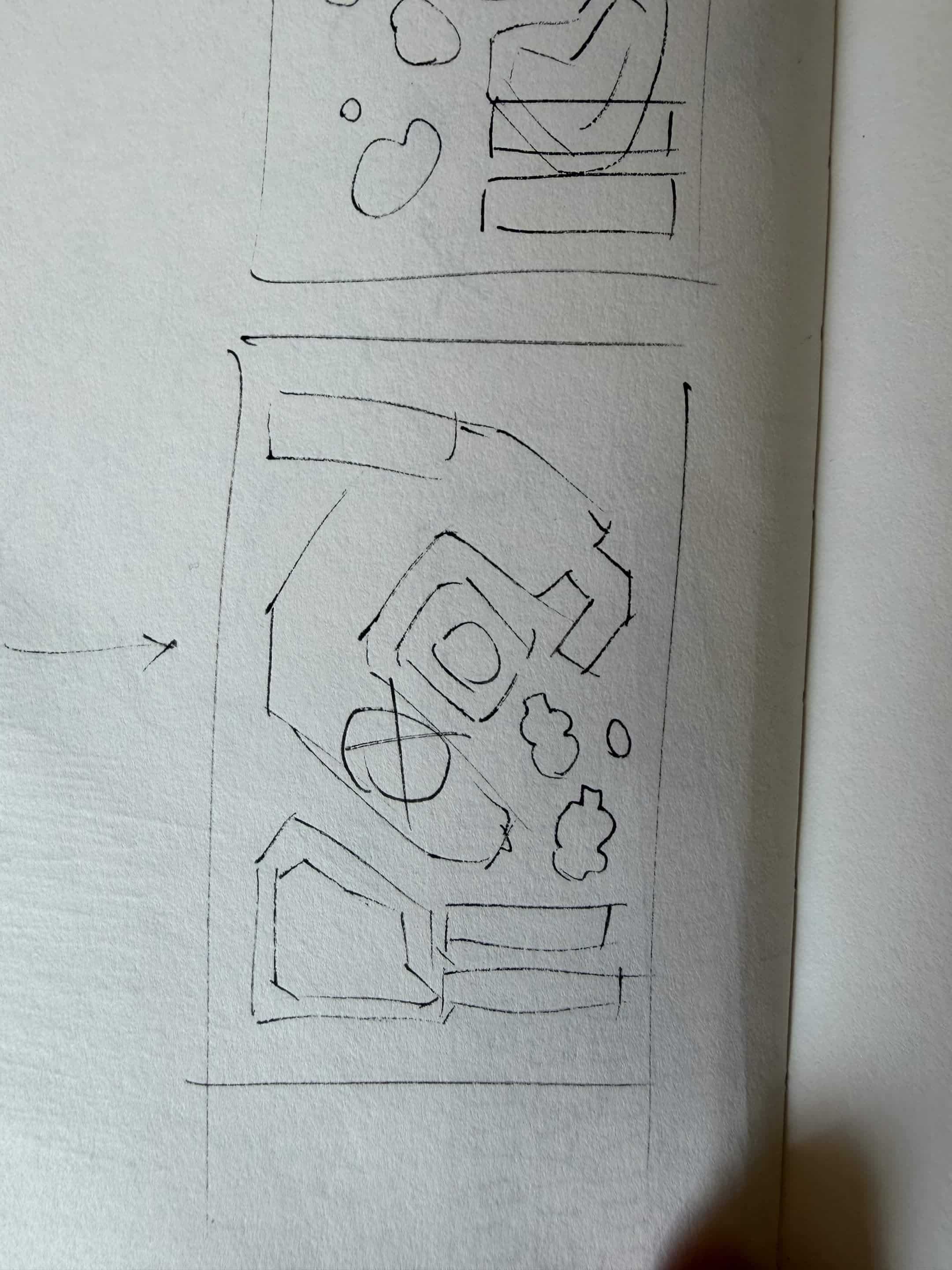
Because Sibylla Merian's winged patrons are unconstrained by gravity, I designed a unique store layout where any surface could be a floor. The store's use of organic materials allows the colours of the garments/exoskeletons to take a visual centre stage. The store incorporates entomological motifs into its design - the decorative microscope-shaped chandelier that doubles as a sales counter, and magnifying glasses as decorative lids, windows, and tools for garment inspection. Most notably, the store's shelves and seating mirror that of insect pinning displays, elevating Sibylla Merian's garments and patrons as specimens to be studied and admired. Pins for the clothing and the store's handles are constructed out of copper to resemble the antenna shape in the store's logo.
Bug images used to texture exoskeletons throughout the store are covered by the Pexels License and CC0 images from iNaturalist.
Part of a collaborative exercise in developing a design system for an imaginary brand in DESMA 142 - Design Systems. To see my work alongside my peers' for the full design identity, view our Figma presentation here.
Sibylla Merian, named after the scientist who contributed to our modern understanding of metamorphosis, is a speculative fashion brand for anthropomorphic insects I designed collaboratively with Ash Ericson, August Hattiangadi, Dina Alkhateeb, and Sana Indap. The brand puts forth that there is a natural basis for its garments' superior beauty, incentivising its customers to buy elegant new "exoskeletons" - "the person reading already has the capacity to recognize beauty. They simply need to be shown where to look."
For Sibylla Merian's logo, I sought to capture the quirky yet elegant organicity of the insect form. The thin stems of the M are reminiscent of an insect's legs and taper into the organic bulbs that are repeated as a serif and on the ends of the ornamental antenna shape surmounting the letterforms. The logo's shapes are constructed primarily to register as a butterfly-like abstraction, open-ended enough to read as a variety of poses. Only under sustained observation should the letterforms become clear.
Because Sibylla Merian's winged patrons are unconstrained by gravity, I designed a unique store layout where any surface could be a floor. The store's use of organic materials allows the colours of the garments/exoskeletons to take a visual centre stage. The store incorporates entomological motifs into its design - the decorative microscope-shaped chandelier that doubles as a sales counter, and magnifying glasses as decorative lids, windows, and tools for garment inspection. Most notably, the store's shelves and seating mirror that of insect pinning displays, elevating Sibylla Merian's garments and patrons as specimens to be studied and admired. Pins for the clothing and the store's handles are constructed out of copper to resemble the antenna shape in the store's logo.
Bug images used to texture exoskeletons throughout the store are covered by the Pexels License and CC0 images from iNaturalist.
HOLD-ME CONTROLLER. March 2026.
A custom controller / designed object developed for DESMA 152 - Tangible Media.
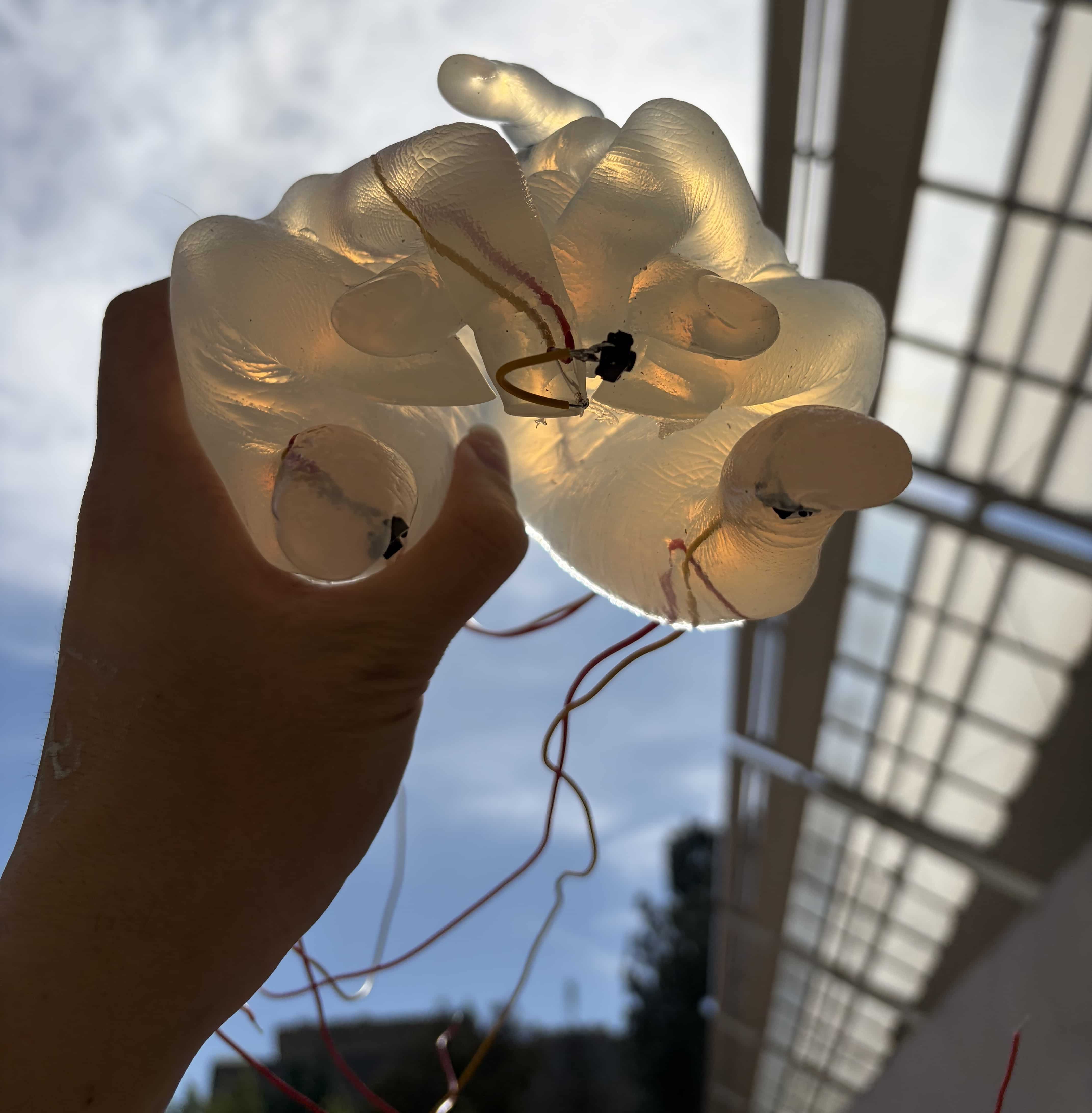
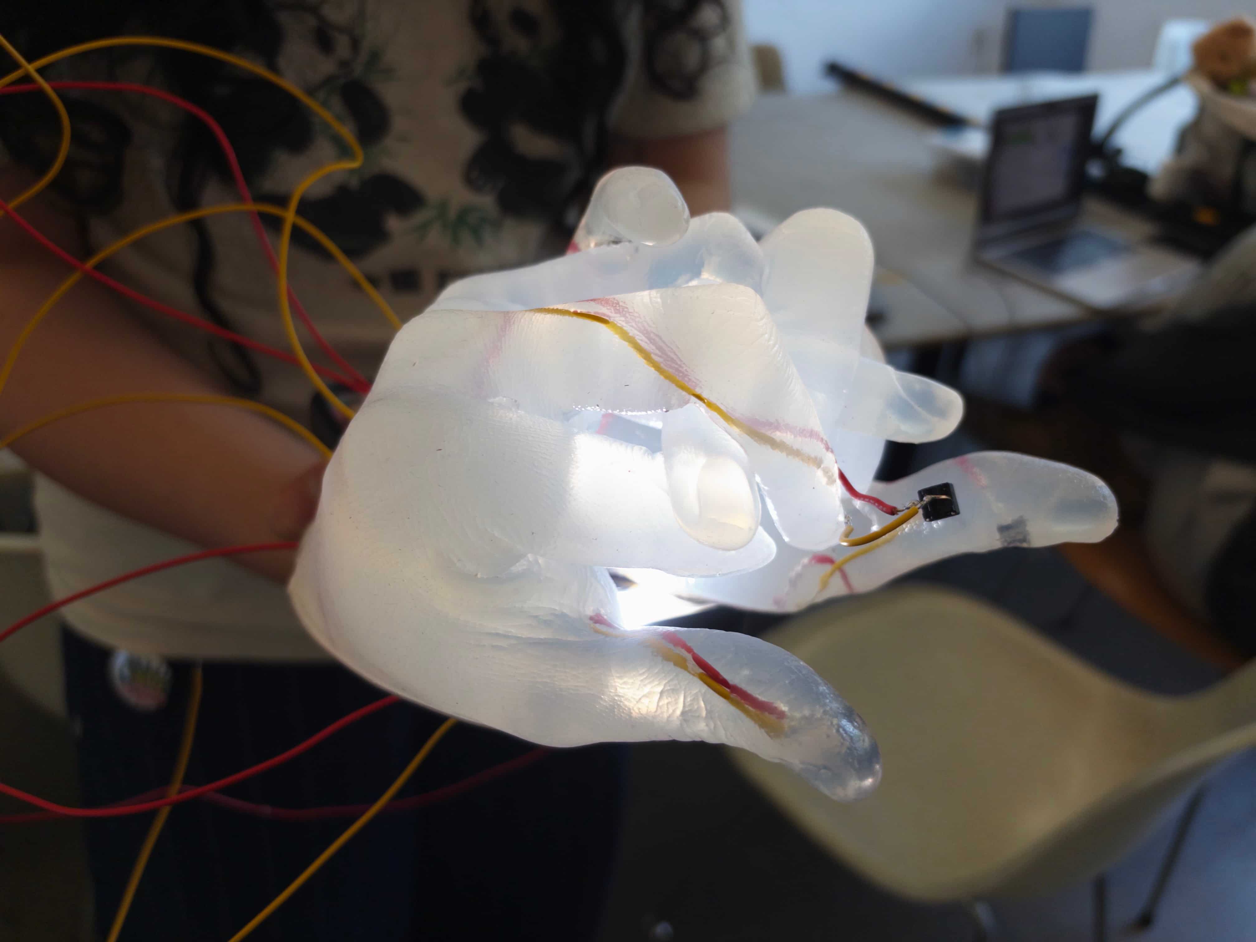
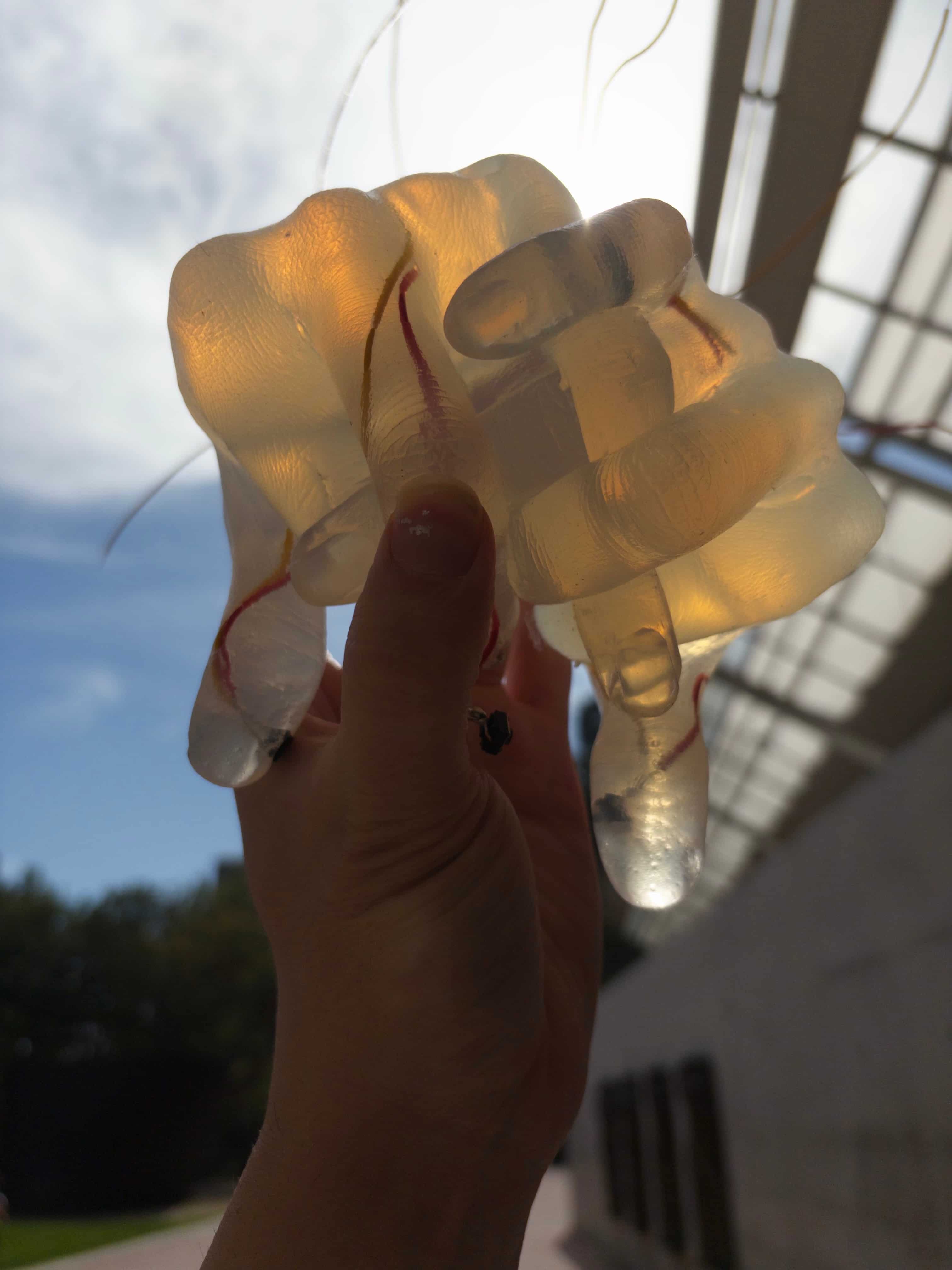
Made via silicone casting, soldered circuitry, and an Adafruit Feather.
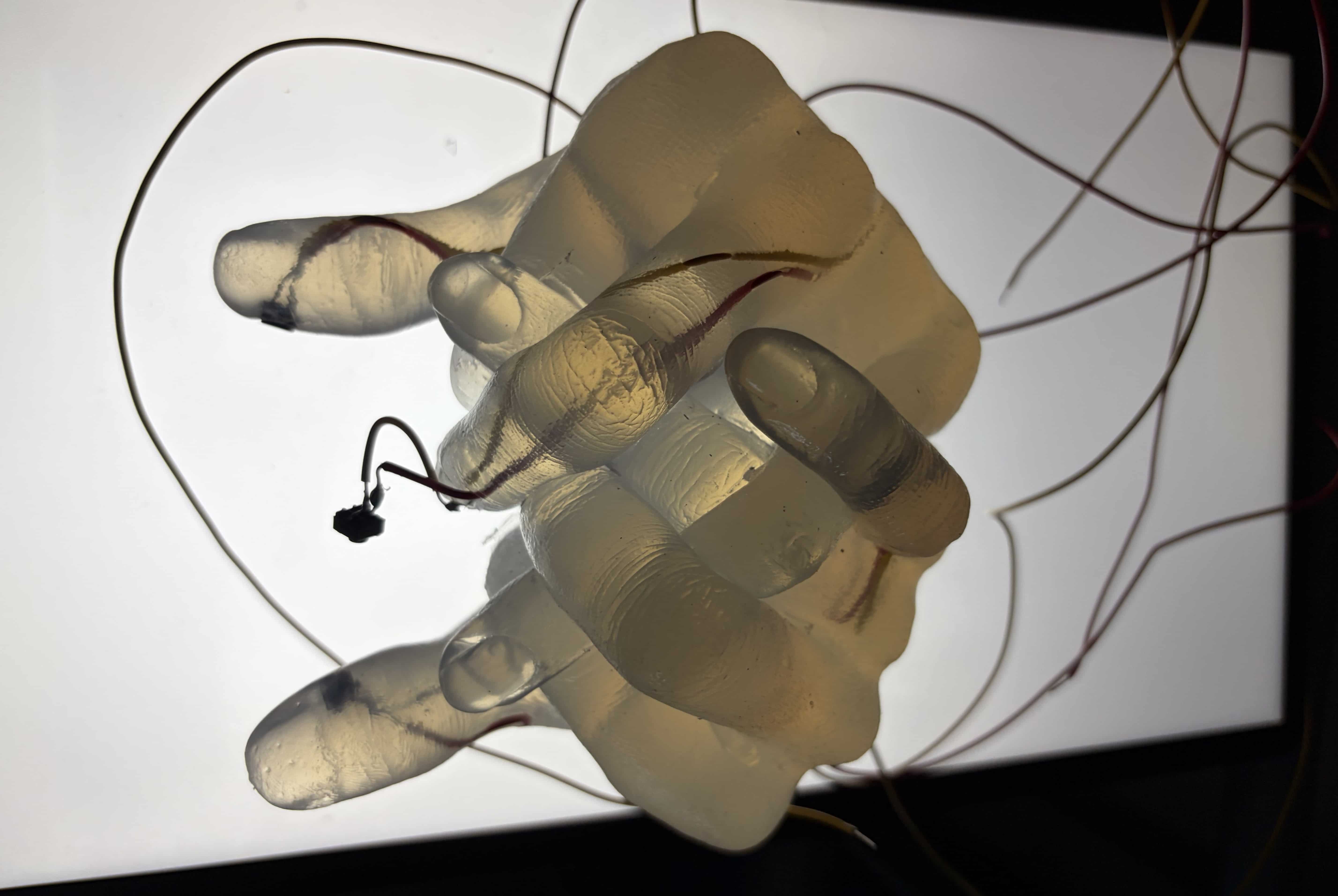
Using the Hold-Me for gameplay is an intimate experience. In order to properly access its buttons, users have to cradle its soft silicone body in their hands, caressing its cold, gelatinous thumbs with their own. The wires threaded through the Hold-Me's casted body are soldered to four buttons: two embedded in each thumb, one sticking out of the index finger like an antenna, and one hidden coyly between its overlapping pinkies. When pressed, the buttons send inputs into an arduino chip that converts them into keyboard inputs, allowing users to play a variety of games (or type four-letter words, I suppose).
The Hold-Me sits in the grey between object and person. It's an extreme experiment in mimicking the intimacy of physical contact through a flawed surrogate, making some who engage with it feel accompanied and others hyperaware of their intimate contact's lack of reciprocity.
If I were to make the Hold-Me again knowing what I know now, I'd probably have altered its base for more comfortable holding, or maybe create the mould from an altered 3D-print of my hands instead of just a raw cast. I also think a base with a light would help enhance the project, taking advantage of the materiality of the silicone and its unique interactions with light. This was an experiment in designing with interactive circuitry and I wanted that to (literally, I guess) imbue that with an organic form of handiwork. It's an object designed to be slightly uneasy, and it succeeds on that front. After working on it, I'm eager to explore designed objects that stylistically feel more universally approachable but maintaining some grains of this unique esotericism.
A custom controller / designed object developed for DESMA 152 - Tangible Media.
Made via silicone casting, soldered circuitry, and an Adafruit Feather.
Using the Hold-Me for gameplay is an intimate experience. In order to properly access its buttons, users have to cradle its soft silicone body in their hands, caressing its cold, gelatinous thumbs with their own. The wires threaded through the Hold-Me's casted body are soldered to four buttons: two embedded in each thumb, one sticking out of the index finger like an antenna, and one hidden coyly between its overlapping pinkies. When pressed, the buttons send inputs into an arduino chip that converts them into keyboard inputs, allowing users to play a variety of games (or type four-letter words, I suppose).
The Hold-Me sits in the grey between object and person. It's an extreme experiment in mimicking the intimacy of physical contact through a flawed surrogate, making some who engage with it feel accompanied and others hyperaware of their intimate contact's lack of reciprocity.
If I were to make the Hold-Me again knowing what I know now, I'd probably have altered its base for more comfortable holding, or maybe create the mould from an altered 3D-print of my hands instead of just a raw cast. I also think a base with a light would help enhance the project, taking advantage of the materiality of the silicone and its unique interactions with light. This was an experiment in designing with interactive circuitry and I wanted that to (literally, I guess) imbue that with an organic form of handiwork. It's an object designed to be slightly uneasy, and it succeeds on that front. After working on it, I'm eager to explore designed objects that stylistically feel more universally approachable but maintaining some grains of this unique esotericism.
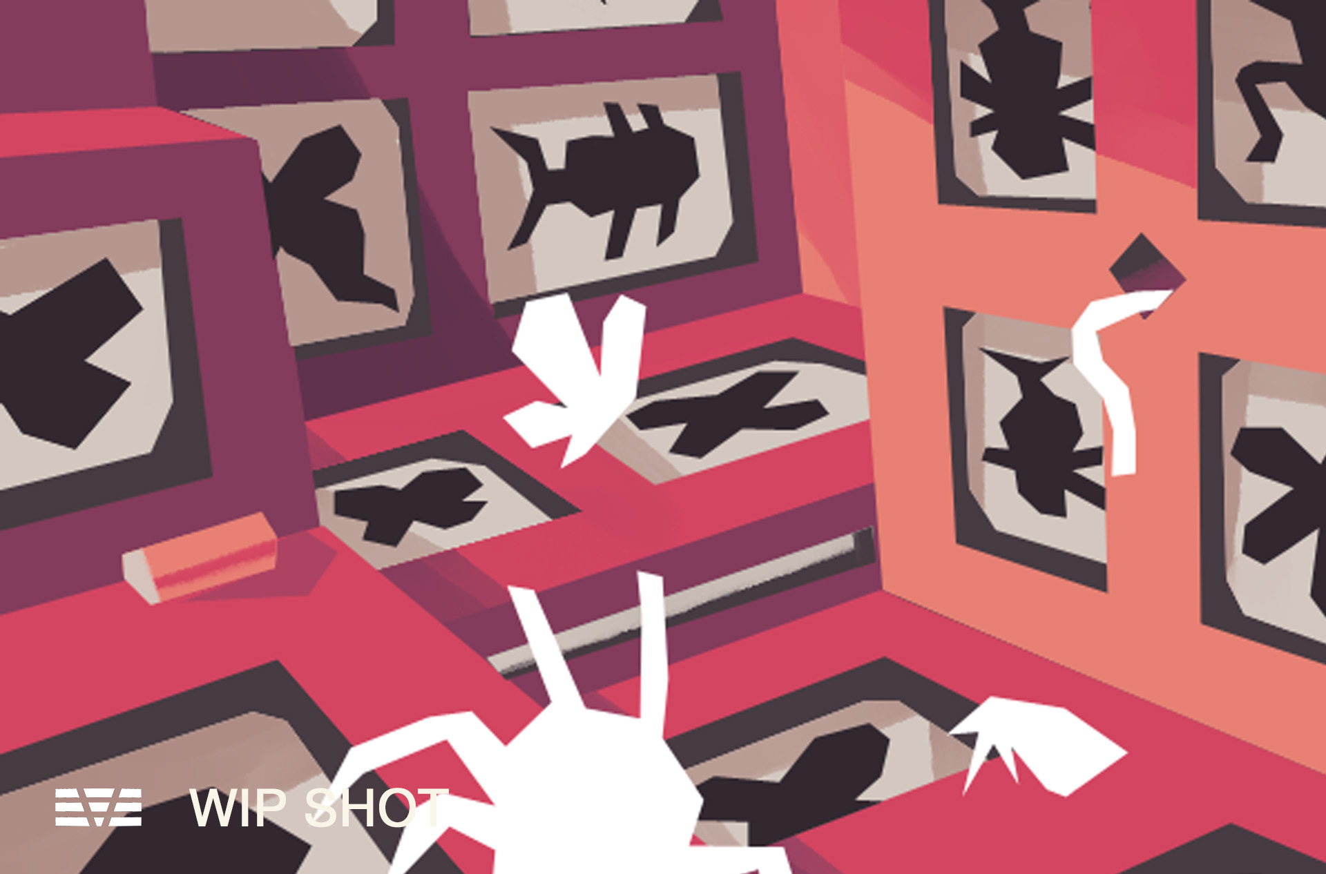
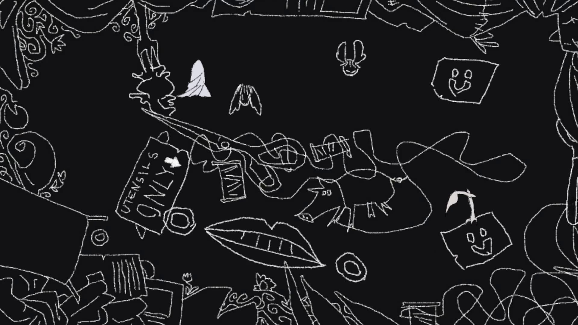
I DREAM OF GREED. Developed in DESMA 158 - Game Engine. December 2025.
Video Game, coded in Unity. Animated and illustrated in Clip Studio Paint. Displayed on the UCLA Game Lab website!
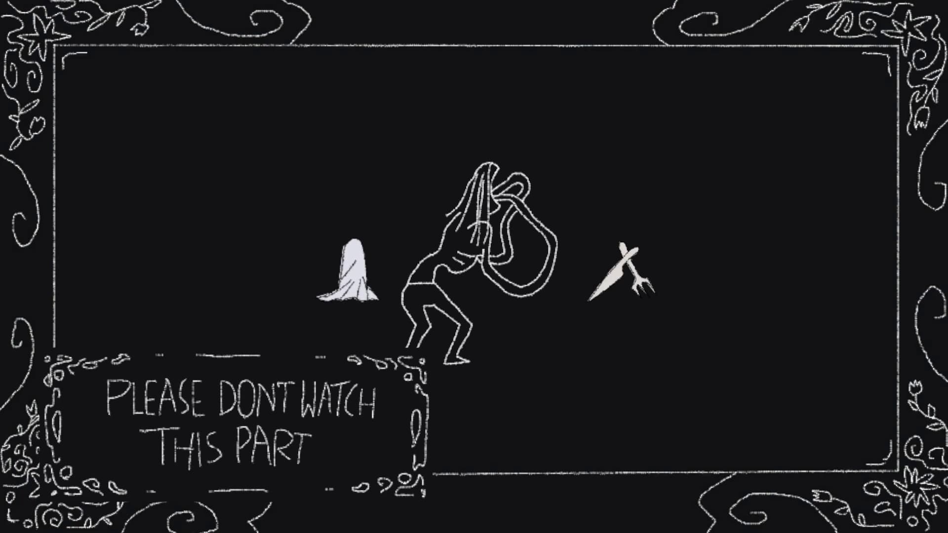
The game's didactic description: In the dead of night, the serenity of the house is interrupted by an insatiable appetite. Travel deeper and deeper into the abyss, killing flies and mopping up slime. Commune with nocturnal beasts and witness the ravenous undoing of the day's abstinence. I Dream of Greed is a multiplayer experience. WASD controls the utensils, and the arrow keys control the cloth.
Exhibited at the Design | Media Arts Acid Reflux exhibition and on the UCLA Game Lab website .
Video Game, coded in Unity. Animated and illustrated in Clip Studio Paint. Displayed on the UCLA Game Lab website!
The game's didactic description: In the dead of night, the serenity of the house is interrupted by an insatiable appetite. Travel deeper and deeper into the abyss, killing flies and mopping up slime. Commune with nocturnal beasts and witness the ravenous undoing of the day's abstinence. I Dream of Greed is a multiplayer experience. WASD controls the utensils, and the arrow keys control the cloth.
Exhibited at the Design | Media Arts Acid Reflux exhibition and on the UCLA Game Lab website .
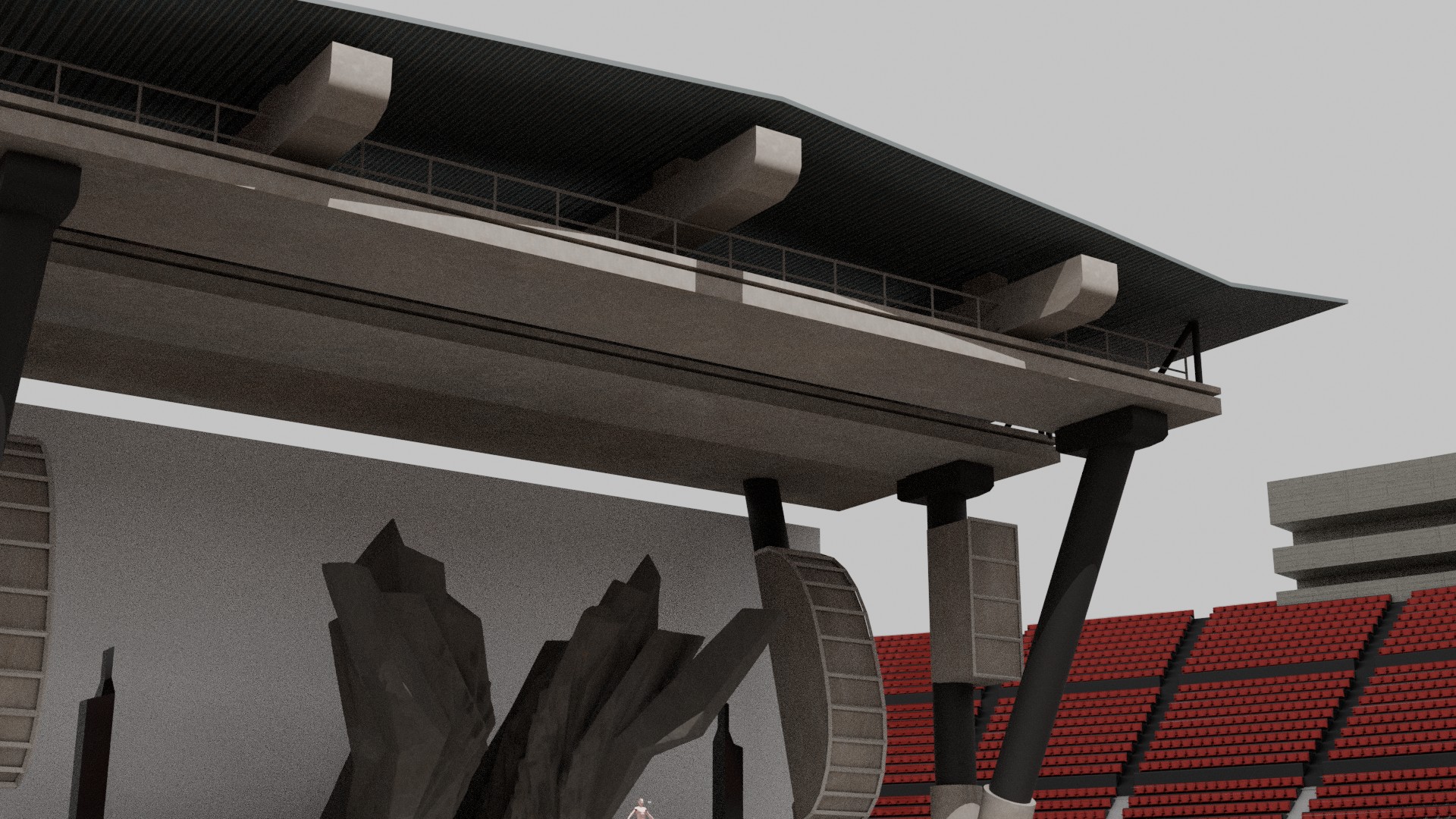
Alan Walker - Faded - 10th Anniversary (Animated Music Video). December 2025.
Background 3D modeling and design by me.
For Alan Walker’s Faded 10th Anniversary edition, I worked with Retrever to model, texture, and render environments and objects across the majority of the music video’s scenes using a Blender animation pipeline. My initial duties were to ‘greybox’, lay out general scene compositions without complex models to use in animatics that were submitted to Alan Walker’s team for approval. Once our scene layouts were approved with suggestions, I edited and finalised each scene’s environment with complex 3D models and PBR textures. I enjoyed working on the stadium scene the most, where I had to approach the challenge of modeling the complex rows of seats while keeping things low-poly for efficient rendering. Working on this project pushed me out of my comfort zone and I enjoyed the problem solving that came with that.
Directed & Produced by Hanlin Su.
CG Supervisor: David Berube.
Lead Animator: Unixety.
Environment Artist: Micky Wright.
Background 3D modeling and design by me.
For Alan Walker’s Faded 10th Anniversary edition, I worked with Retrever to model, texture, and render environments and objects across the majority of the music video’s scenes using a Blender animation pipeline. My initial duties were to ‘greybox’, lay out general scene compositions without complex models to use in animatics that were submitted to Alan Walker’s team for approval. Once our scene layouts were approved with suggestions, I edited and finalised each scene’s environment with complex 3D models and PBR textures. I enjoyed working on the stadium scene the most, where I had to approach the challenge of modeling the complex rows of seats while keeping things low-poly for efficient rendering. Working on this project pushed me out of my comfort zone and I enjoyed the problem solving that came with that.
Directed & Produced by Hanlin Su.
CG Supervisor: David Berube.
Lead Animator: Unixety.
Environment Artist: Micky Wright.
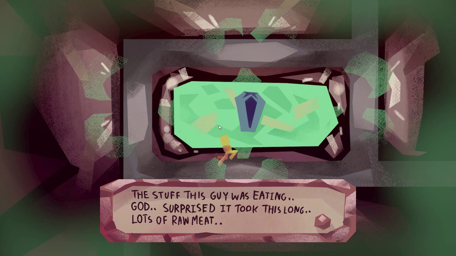
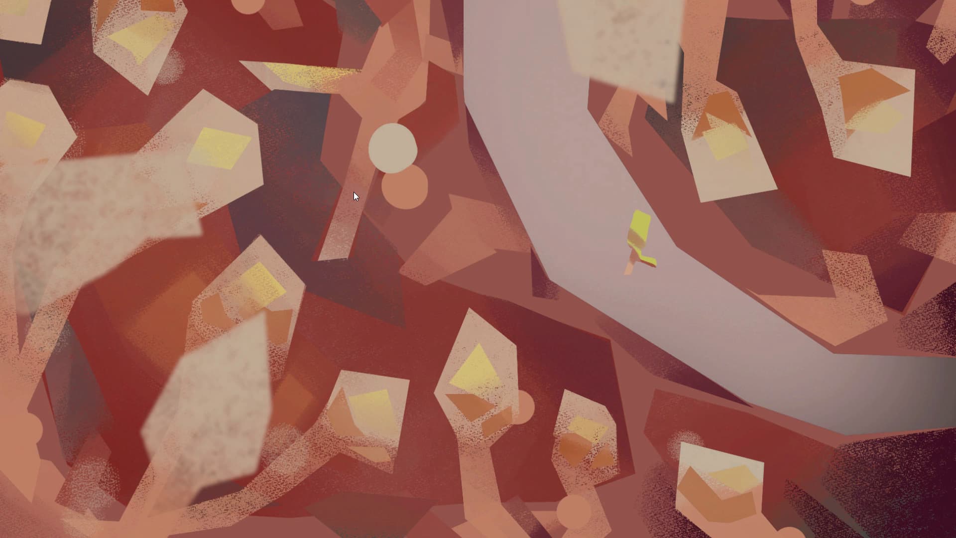
MICROCONDO. May 2025.
A video game developed in DESMA 155 - Interactive Animation. Coded in Unity with animation and illustration from clip studio paint. Displayed on the UCLA Game Lab website!
You're a microbial worker in a body that has just died. Your duty is to go from organ to organ and evict all the disgruntled residents. WASD to move.
For this game, I wanted to create something that was reminiscent of Anodyne 2 or Yume Nikki and focused primarily on engaging with interesting NPCs with less emphasis on puzzle solving mechanics. I spent a lot of time working on the game’s illustrated backgrounds and character animations, and I tried to push myself by giving the player character a difficult-to-animate 3-legged run cycle. Because I was interested in character dialogue and engaging environments, I wanted to design a gameplay experience that prioritised a sense of exploration and ‘wandering’ over traditional puzzle solving mechanics. MicroCondo became an interactive vehicle to showcase my 2D animation and environment art skills and I completed it excited to explore gamemaking involving more complex mechanics.
A video game developed in DESMA 155 - Interactive Animation. Coded in Unity with animation and illustration from clip studio paint. Displayed on the UCLA Game Lab website!
You're a microbial worker in a body that has just died. Your duty is to go from organ to organ and evict all the disgruntled residents. WASD to move.
For this game, I wanted to create something that was reminiscent of Anodyne 2 or Yume Nikki and focused primarily on engaging with interesting NPCs with less emphasis on puzzle solving mechanics. I spent a lot of time working on the game’s illustrated backgrounds and character animations, and I tried to push myself by giving the player character a difficult-to-animate 3-legged run cycle. Because I was interested in character dialogue and engaging environments, I wanted to design a gameplay experience that prioritised a sense of exploration and ‘wandering’ over traditional puzzle solving mechanics. MicroCondo became an interactive vehicle to showcase my 2D animation and environment art skills and I completed it excited to explore gamemaking involving more complex mechanics.
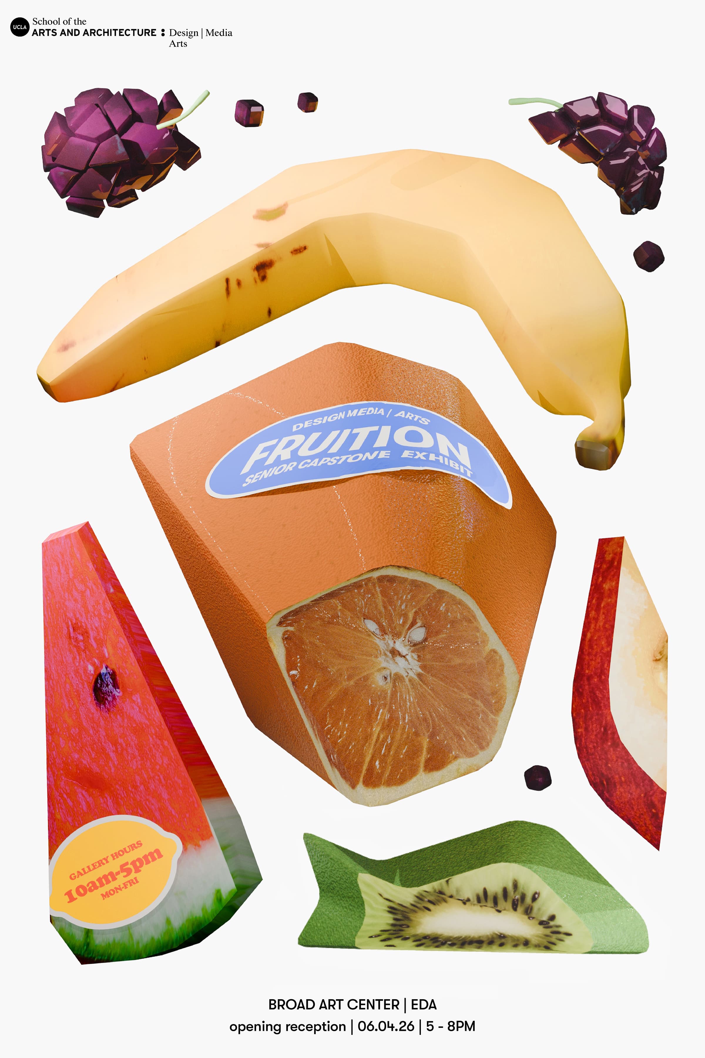
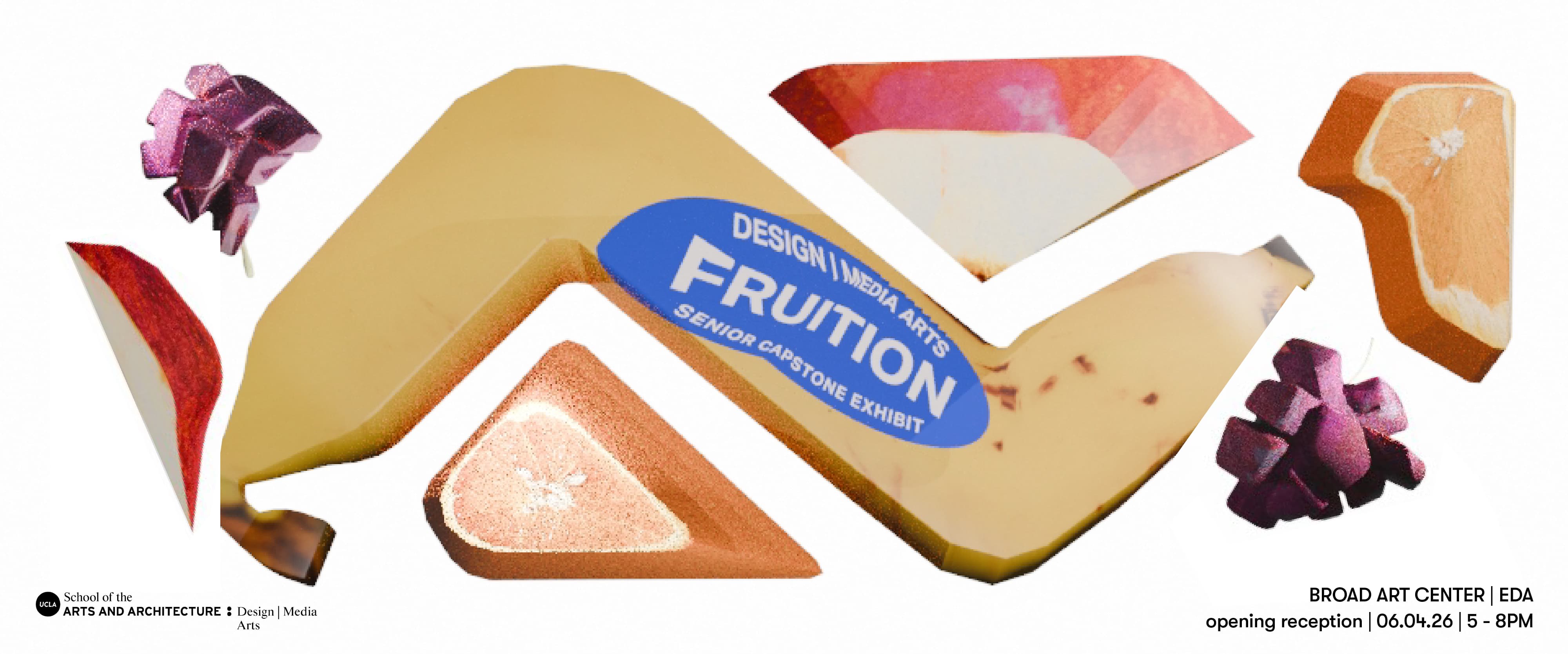
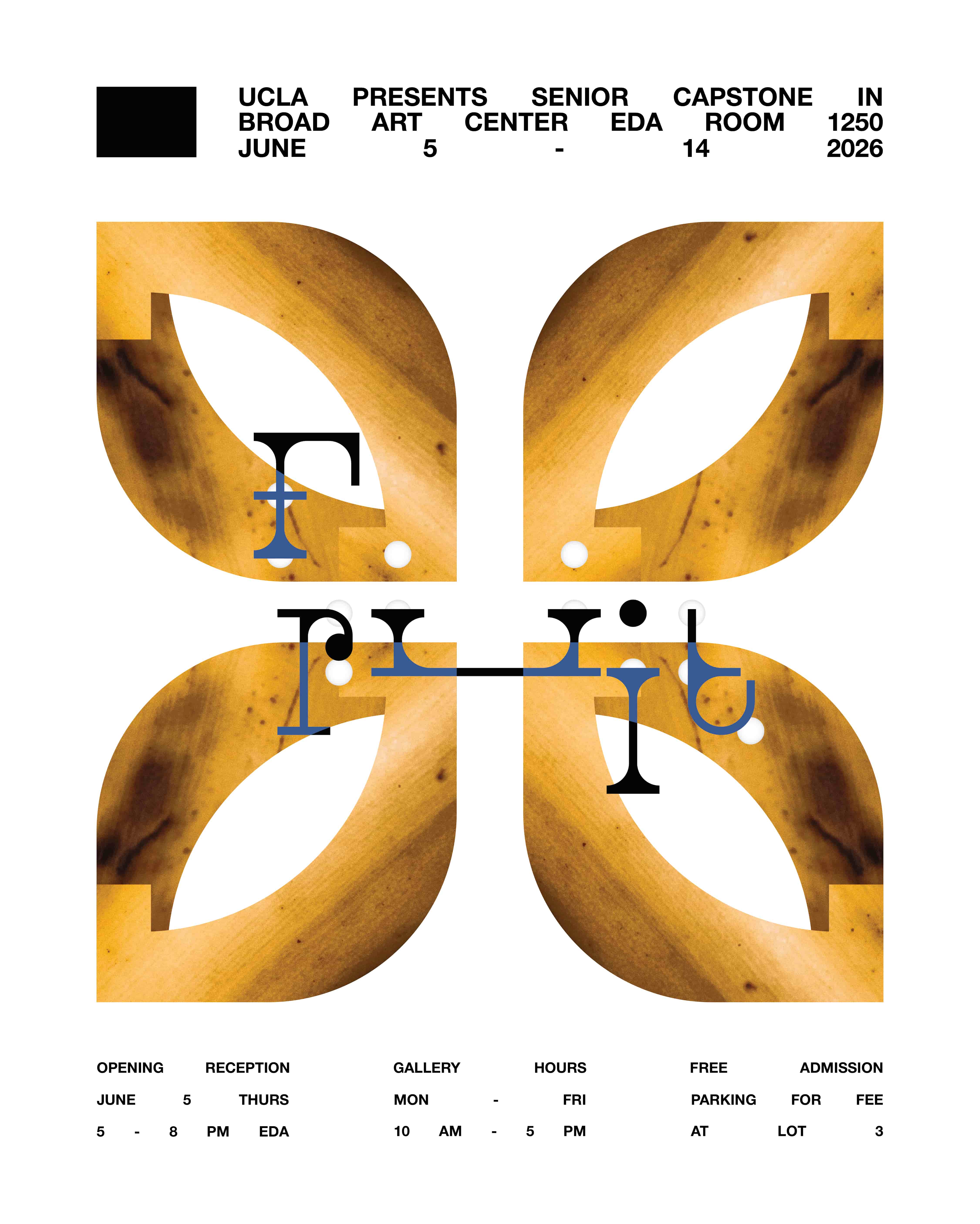
UCLA's Design | Media Arts senior capstone exhibition, Fruition. June 2026.
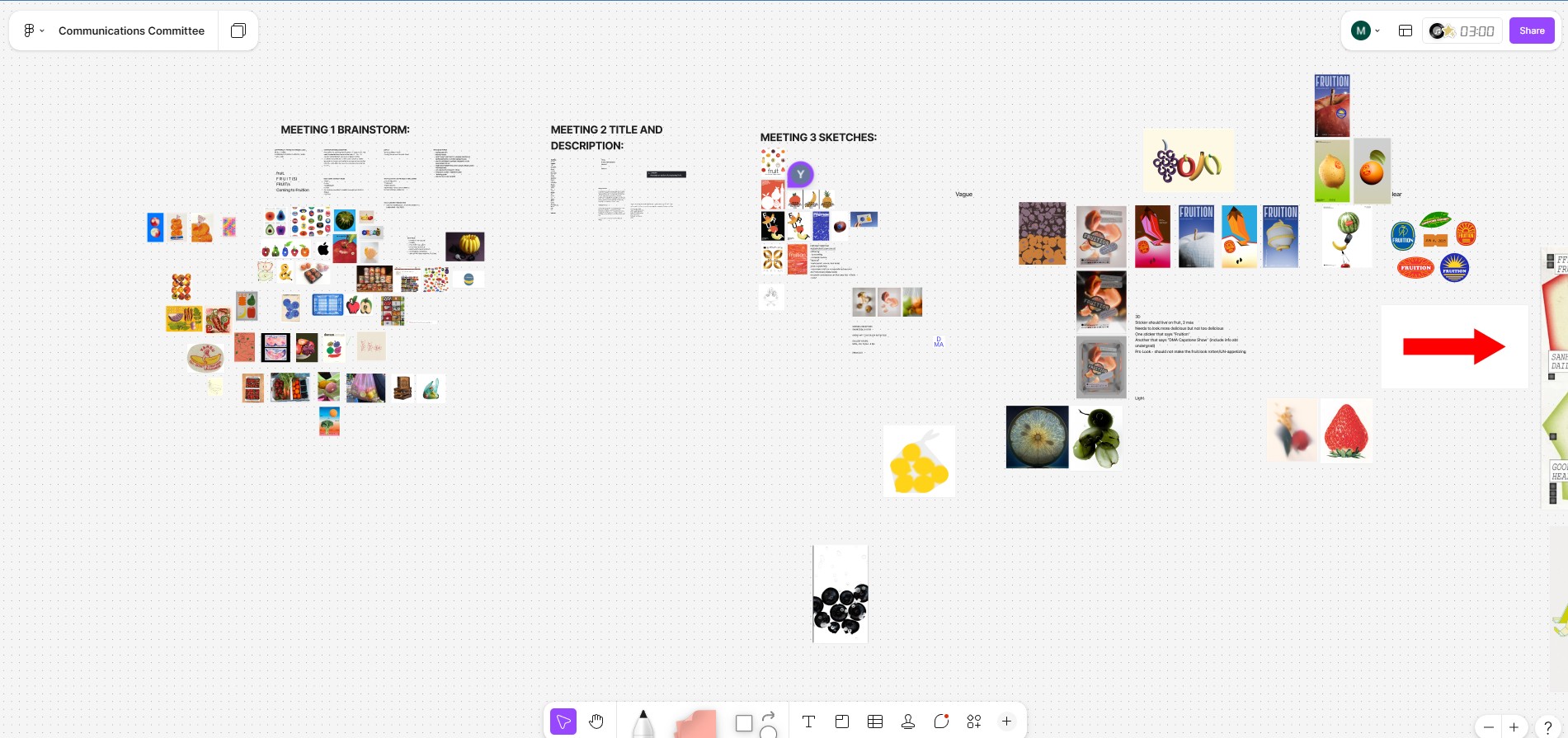
Produced collaboratively in the Capstone Communications Committee.
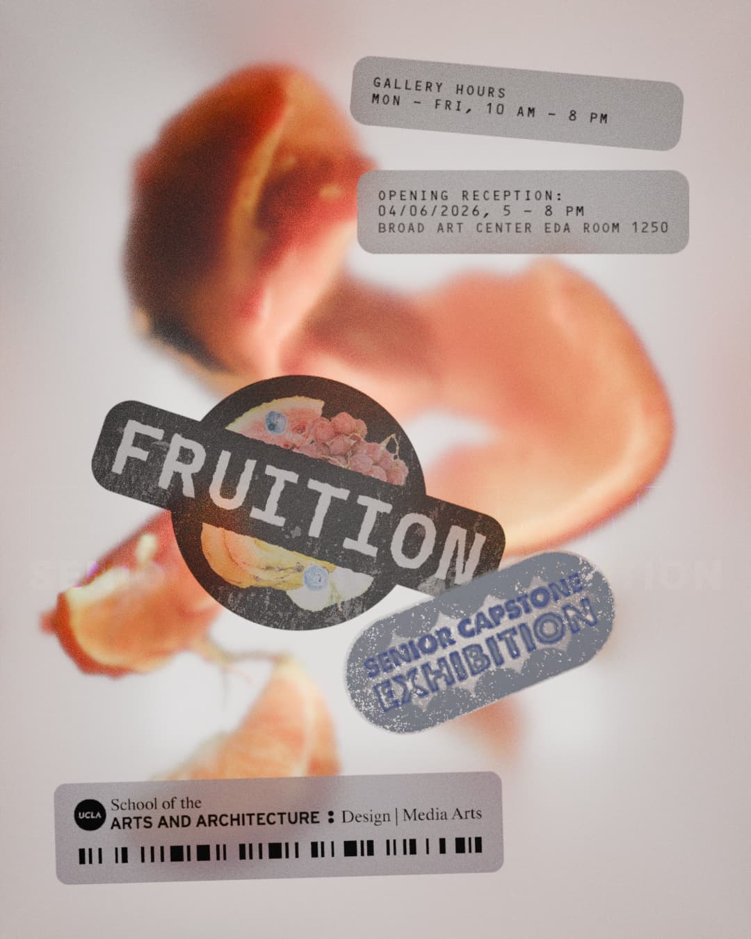
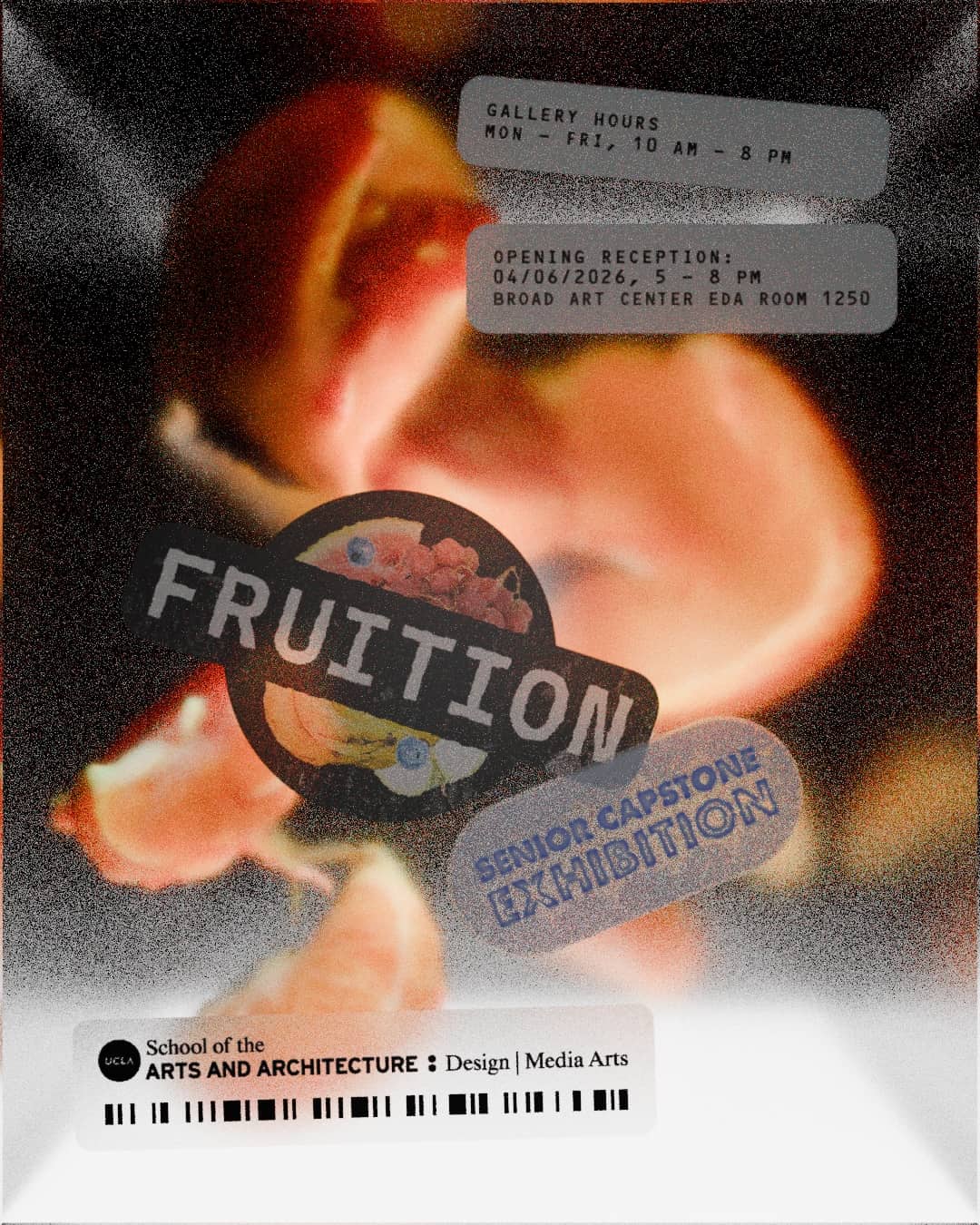
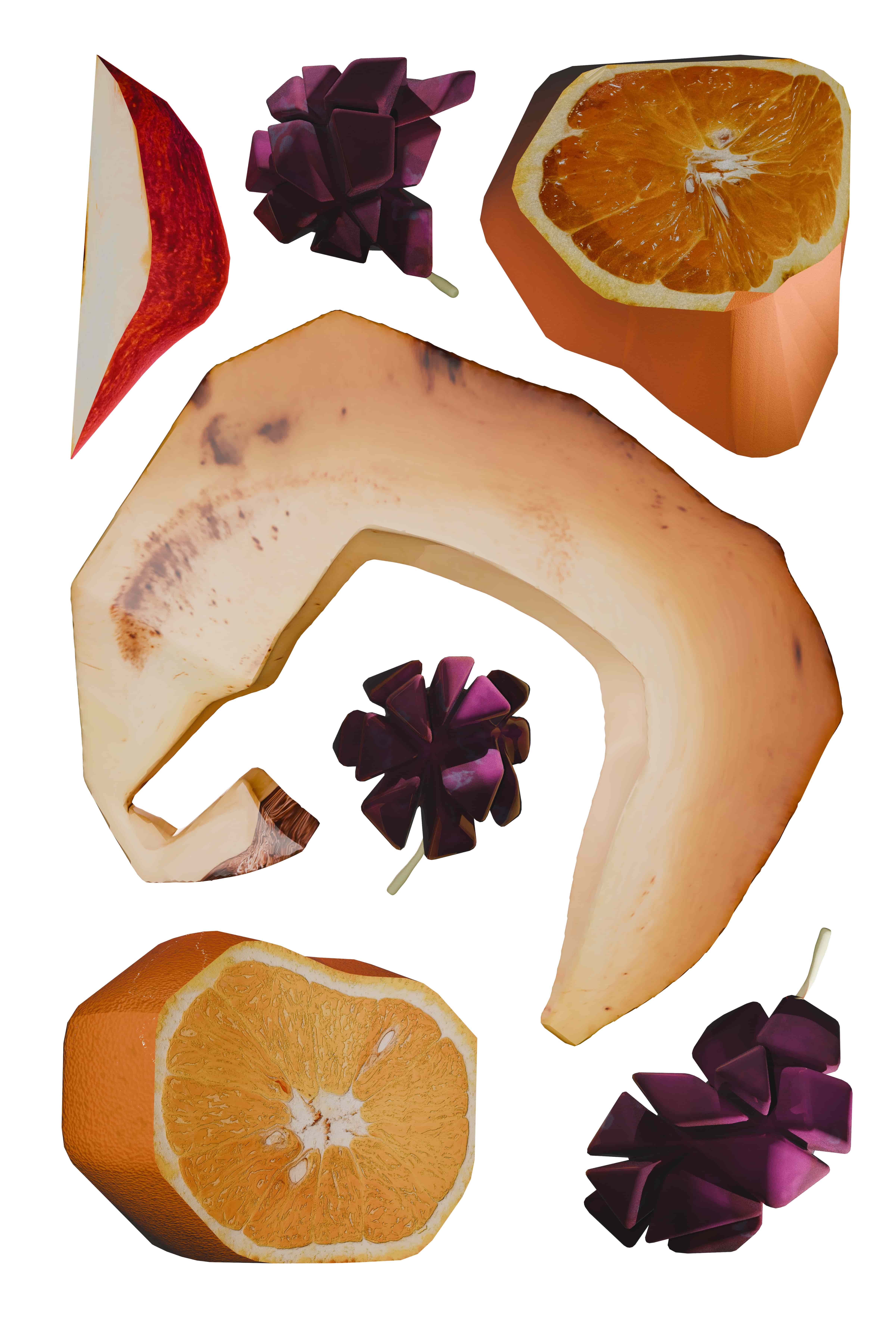
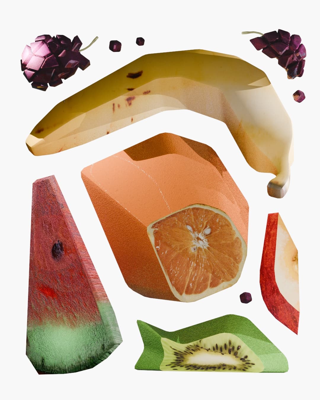
For our capstone exhibtion, my committee members and I wanted to create a playful design identity that would connote that these works were the fruition of years of academic labour growth with a modern and fresh aesthetic look. I pitched the theme "Fruit", which later became "Fruition", and the playful abstract possibilities of the concept resonated well with the rest of the committee. I modeled, textured, and lit the 3D models that were used in our final printed poster and digital marketing assets, posted on the Design | Media Arts instagram and around the Broad Art Center.
Final "Fruition" and "gallery hours" stickers made by Nicolas Disasti and Yash Nasikkar.
Banana in image 3, final lighting, and upscaling by Arya Nasikkar.
Final typographic layout of final poster by Rachel Lee.
Produced collaboratively in the Capstone Communications Committee.
For our capstone exhibtion, my committee members and I wanted to create a playful design identity that would connote that these works were the fruition of years of academic labour growth with a modern and fresh aesthetic look. I pitched the theme "Fruit", which later became "Fruition", and the playful abstract possibilities of the concept resonated well with the rest of the committee. I modeled, textured, and lit the 3D models that were used in our final printed poster and digital marketing assets, posted on the Design | Media Arts instagram and around the Broad Art Center.
Final "Fruition" and "gallery hours" stickers made by Nicolas Disasti and Yash Nasikkar.
Banana in image 3, final lighting, and upscaling by Arya Nasikkar.
Final typographic layout of final poster by Rachel Lee.
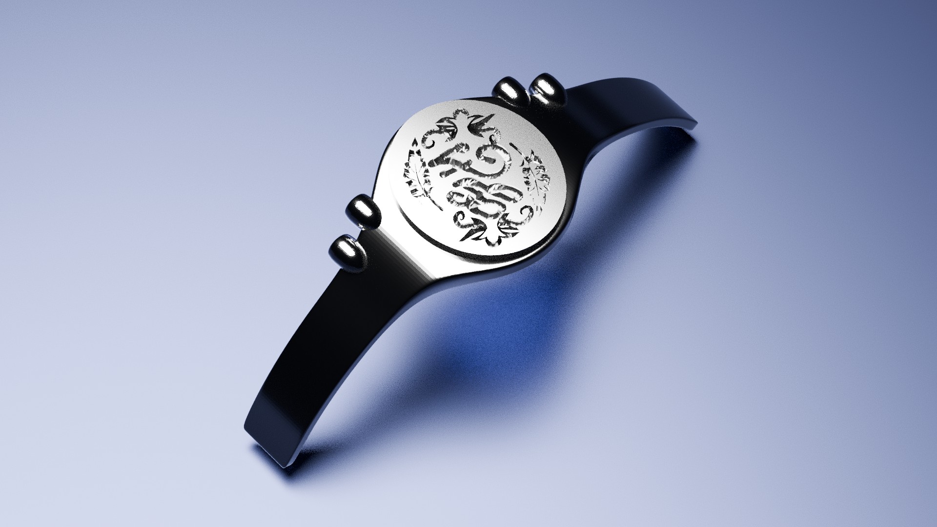
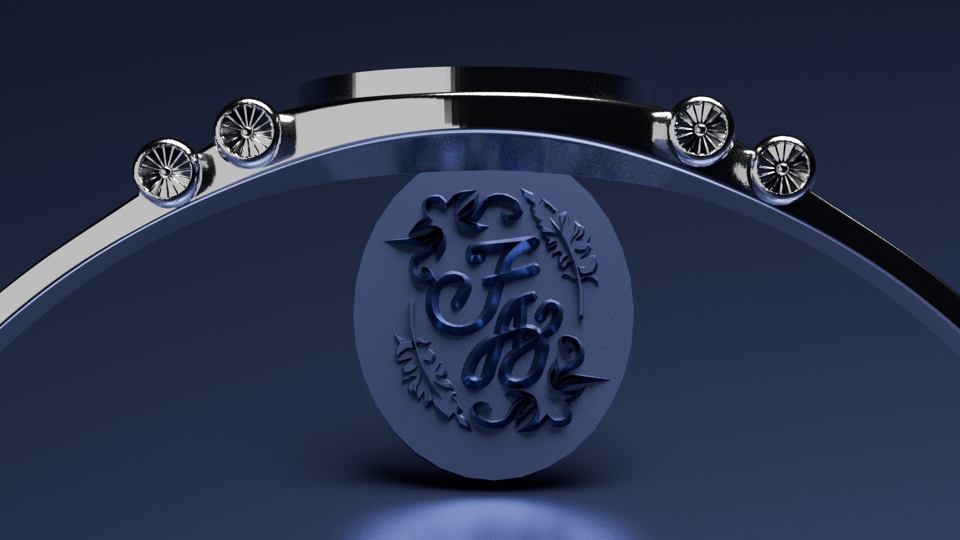
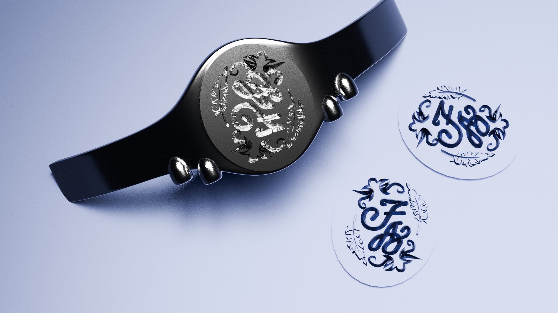
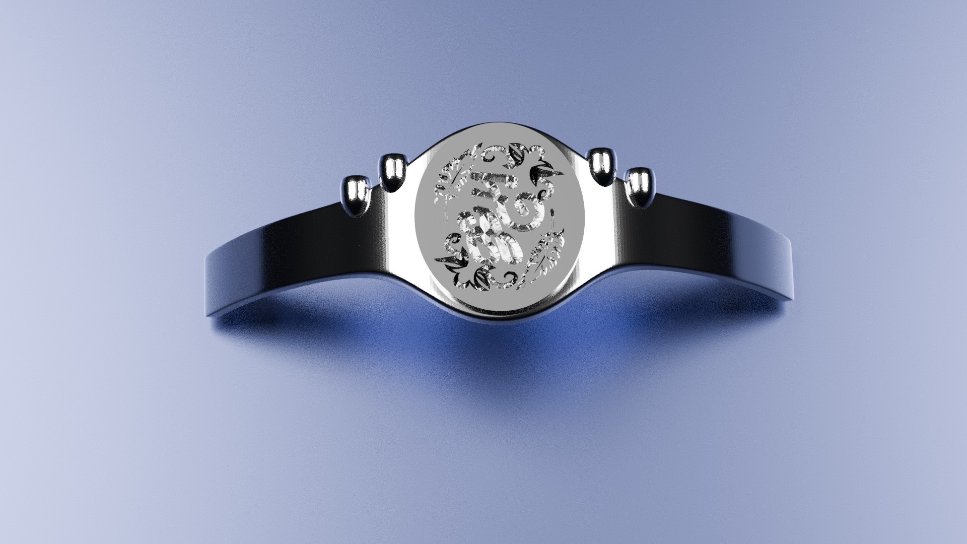
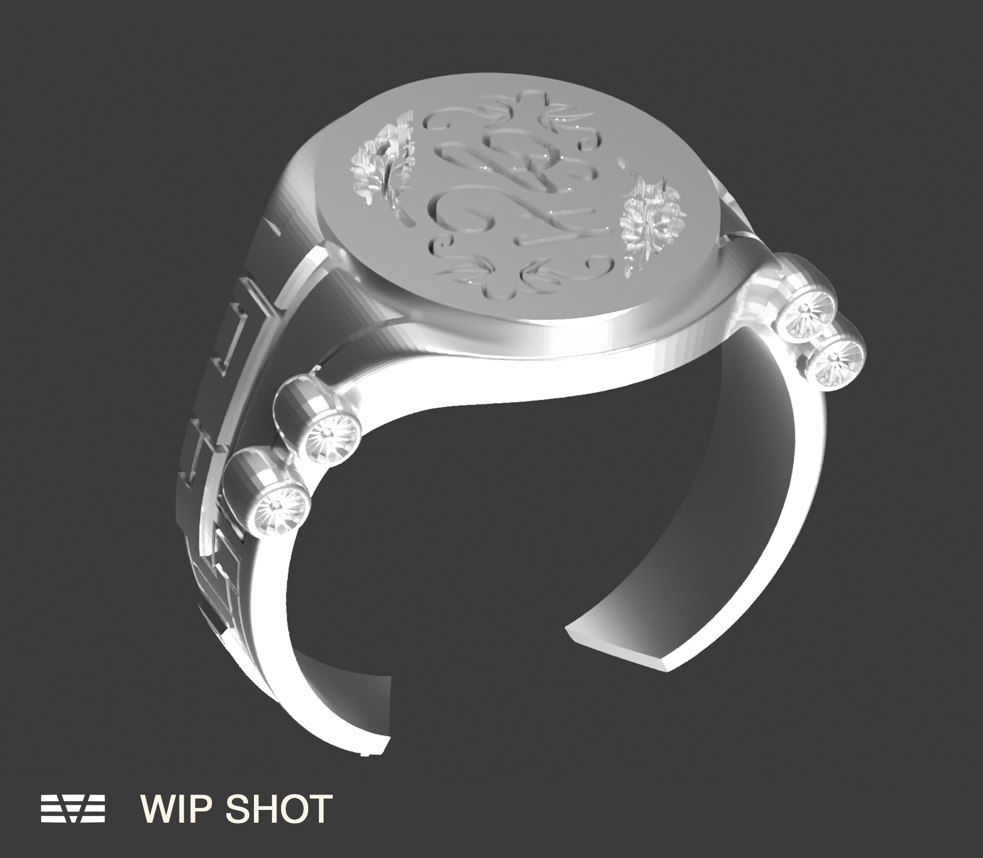
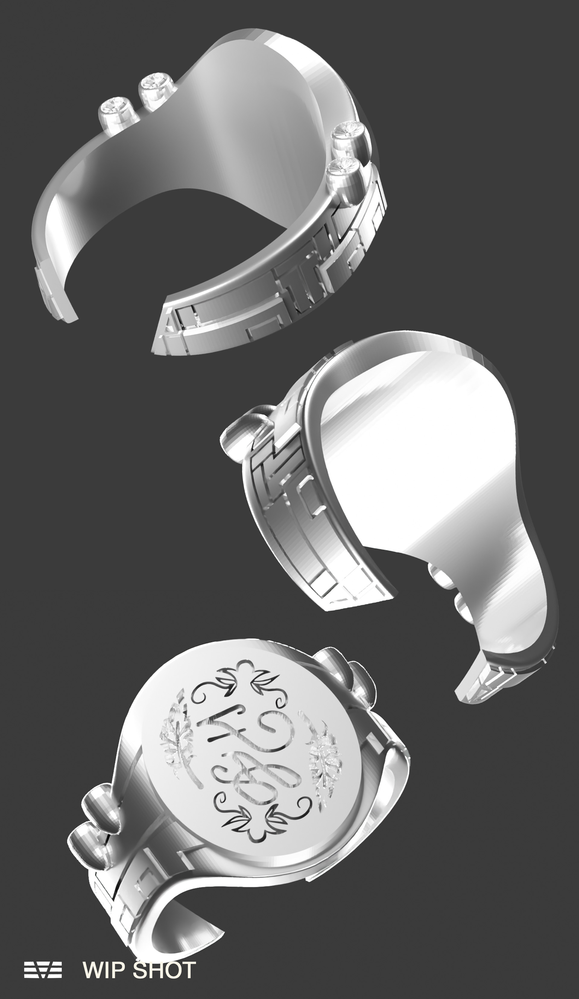
A signet ring designed for Flapping Airplanes. A 3D modelled piece of internal merchandise designed in Blender and Adobe Illustrator. April 2026.
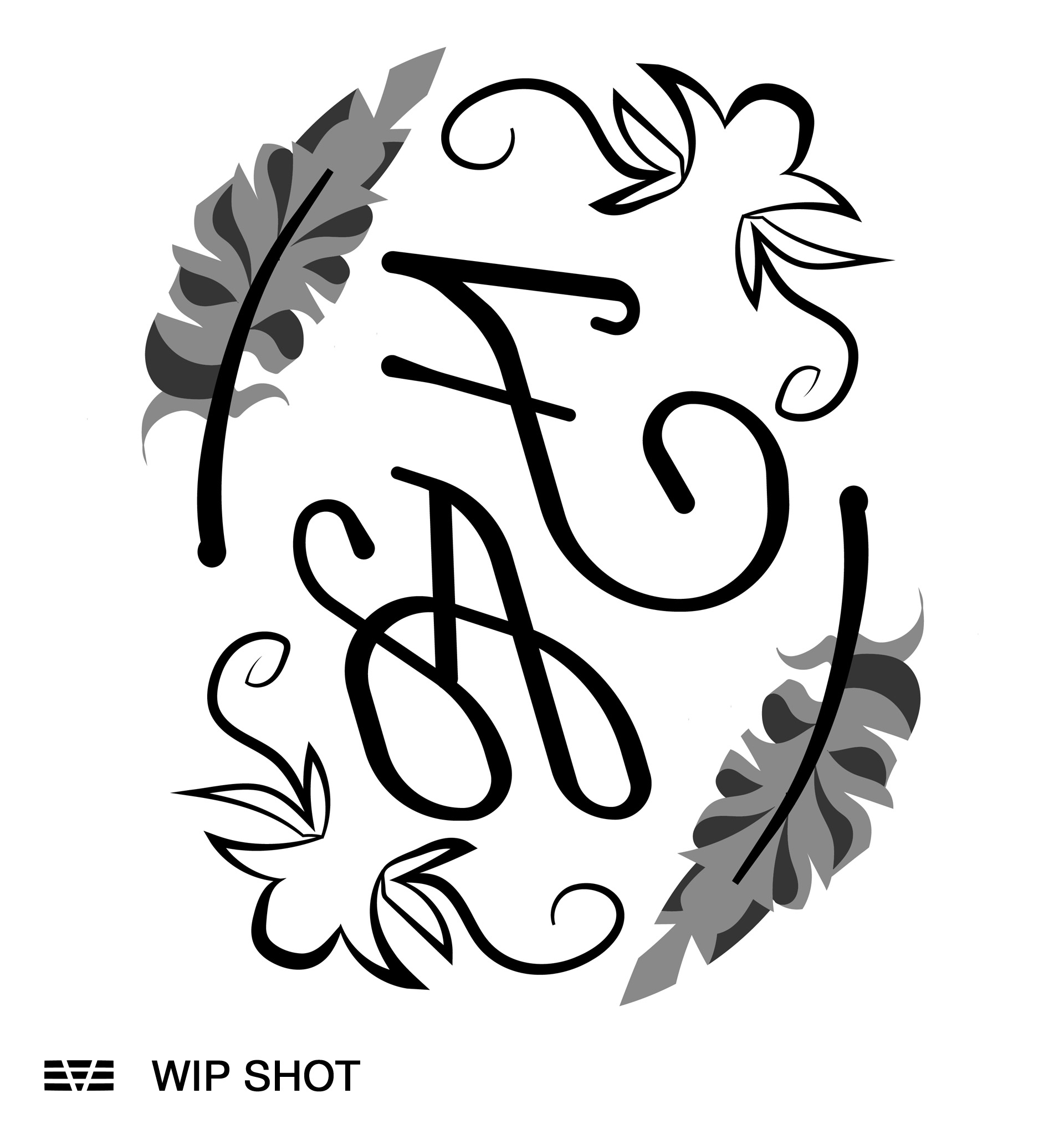
I was responsible for designing the ring's structure and preparing it for fabrication, while the indented signet design was developed collaboratively with August Hattiangadi. The 3D model was printed and used to create a negative mould for casting the ring in sterling silver. While designing this, I had to account for a range of employee ring sizes to maintain consistent measurements to ensure the product’s wearability.
Working on the ring required extensive iterations and mathematical planning. Earlier, more ornamental concepts were scrapped due to material constraints, leading us to opt for a minimal, open shank ring that could be bent into shape post-casting. Because the ring had to be modelled unbent but needed to be appropriately sized once formed into its wearable shape, I had to carefully keep track of a lot of measurements and geometric formulas during the process. A lot of time was spent refining the ring’s details across several iterations and rounds of feedback, making sure the ring’s indented logo was deep and wide enough to produce an impression when pressed into hot wax.
I was responsible for designing the ring's structure and preparing it for fabrication, while the indented signet design was developed collaboratively with August Hattiangadi. The 3D model was printed and used to create a negative mould for casting the ring in sterling silver. While designing this, I had to account for a range of employee ring sizes to maintain consistent measurements to ensure the product’s wearability.
Working on the ring required extensive iterations and mathematical planning. Earlier, more ornamental concepts were scrapped due to material constraints, leading us to opt for a minimal, open shank ring that could be bent into shape post-casting. Because the ring had to be modelled unbent but needed to be appropriately sized once formed into its wearable shape, I had to carefully keep track of a lot of measurements and geometric formulas during the process. A lot of time was spent refining the ring’s details across several iterations and rounds of feedback, making sure the ring’s indented logo was deep and wide enough to produce an impression when pressed into hot wax.
Water. July 2025.
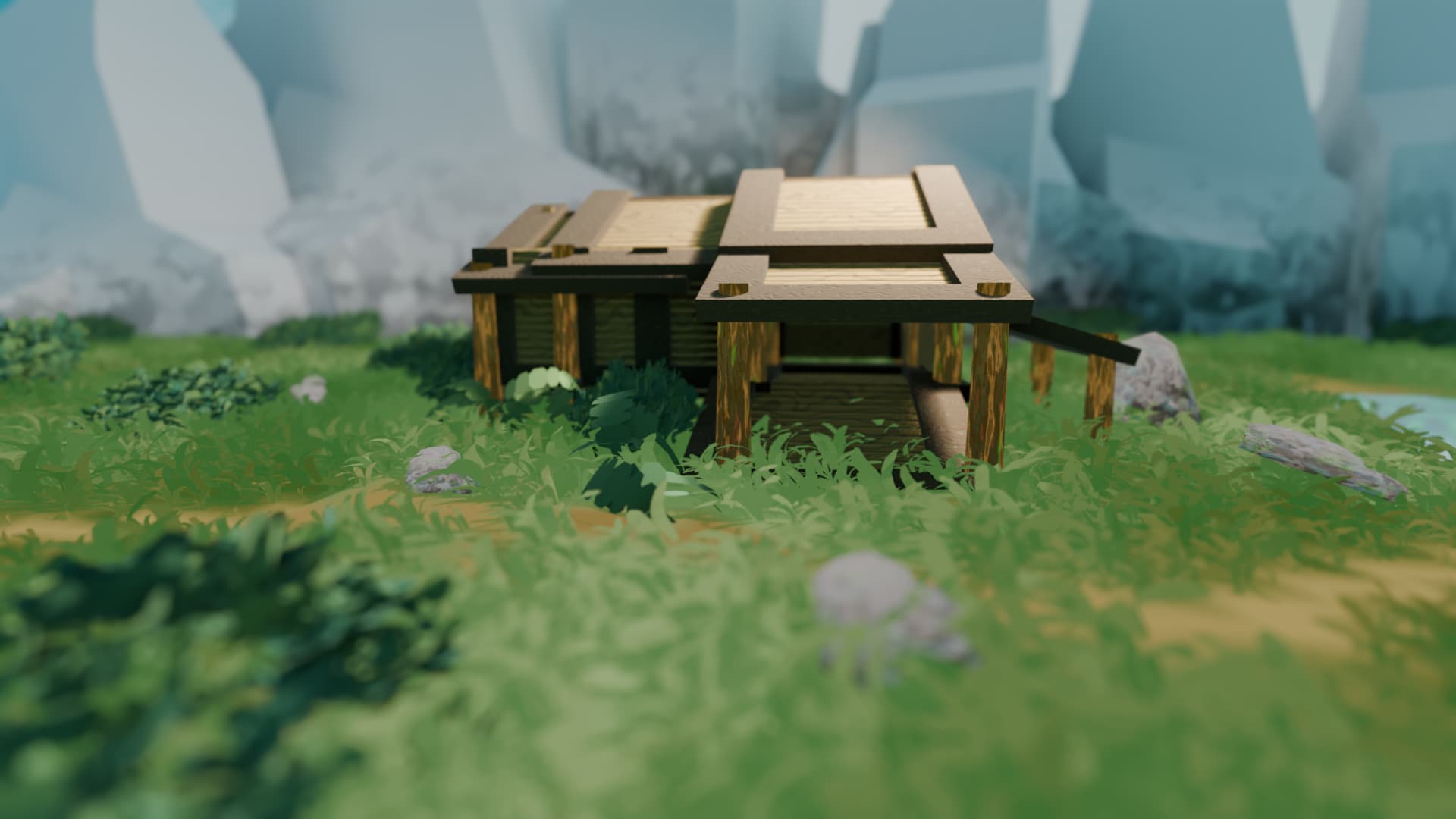
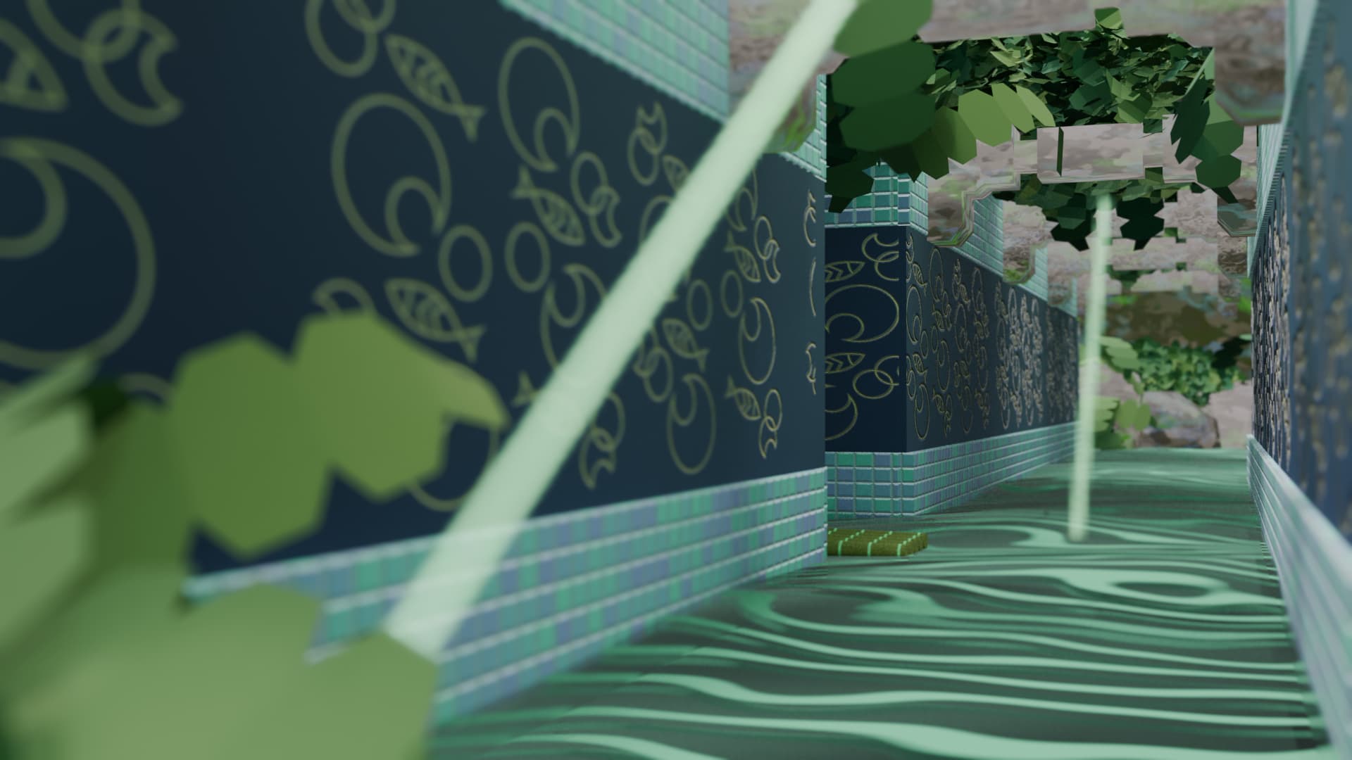
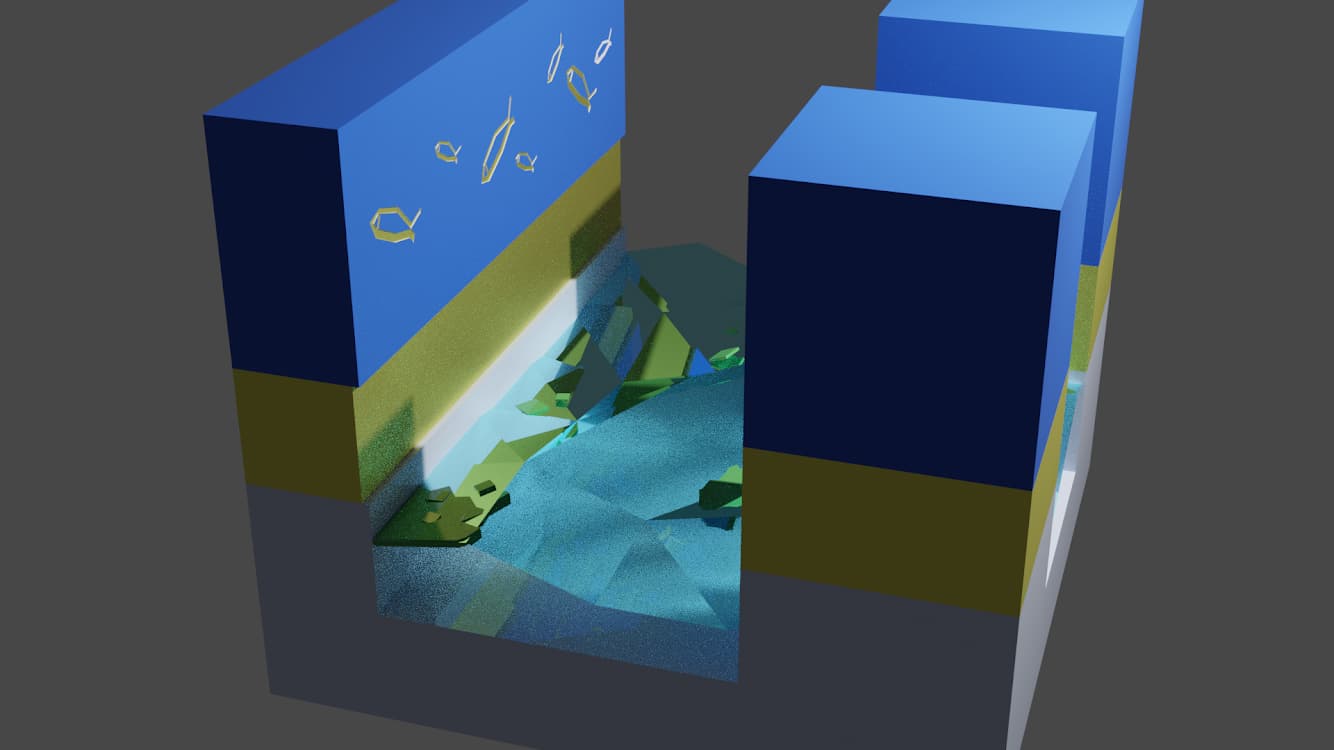
A short film made for DESMA 24 - Motion, in Summer of 2025. The 3D backgrounds are modeled and rendered in Blender, the illustration was done in Photoshop, and final editing was done in Premiere Pro and After Effects.
I often dream of bizarre ecosystems and beautiful architecture, and my favourite of those dreams was the inspiration for Water. I wanted to do something memorable for my first foray into animation as a standalone medium, so I worked to combine my 2D and 3D animation workflows to give Water a sense of charming peculiarity. I modelled the film’s environments in Blender, experimenting with modifiers and shader nodes in unique ways to render the film’s stylised water and rocks. Because I was taking inspiration from a semi-nonsensical dream during the film’s process, portraying the story I had dreamt up with a coherent flow required a lot of creative restructuring and aesthetic reimagining.
Water was also my first time grappling with character animation in a non-looped, filmic style. I was pushed to explore the timing of my subject’s movements in ways I had not considered before, which became an interesting challenge when I had to consider those 2D movements in relation to the film’s rendered backgrounds. Water allowed me to push my 2D animation and 3D rendering abilities to new heights, and I’m proud of what I put together.
A short film made for DESMA 24 - Motion, in Summer of 2025. The 3D backgrounds are modeled and rendered in Blender, the illustration was done in Photoshop, and final editing was done in Premiere Pro and After Effects.
I often dream of bizarre ecosystems and beautiful architecture, and my favourite of those dreams was the inspiration for Water. I wanted to do something memorable for my first foray into animation as a standalone medium, so I worked to combine my 2D and 3D animation workflows to give Water a sense of charming peculiarity. I modelled the film’s environments in Blender, experimenting with modifiers and shader nodes in unique ways to render the film’s stylised water and rocks. Because I was taking inspiration from a semi-nonsensical dream during the film’s process, portraying the story I had dreamt up with a coherent flow required a lot of creative restructuring and aesthetic reimagining.
Water was also my first time grappling with character animation in a non-looped, filmic style. I was pushed to explore the timing of my subject’s movements in ways I had not considered before, which became an interesting challenge when I had to consider those 2D movements in relation to the film’s rendered backgrounds. Water allowed me to push my 2D animation and 3D rendering abilities to new heights, and I’m proud of what I put together.
Pre-UCLA portfolio. 2023 - 2024.
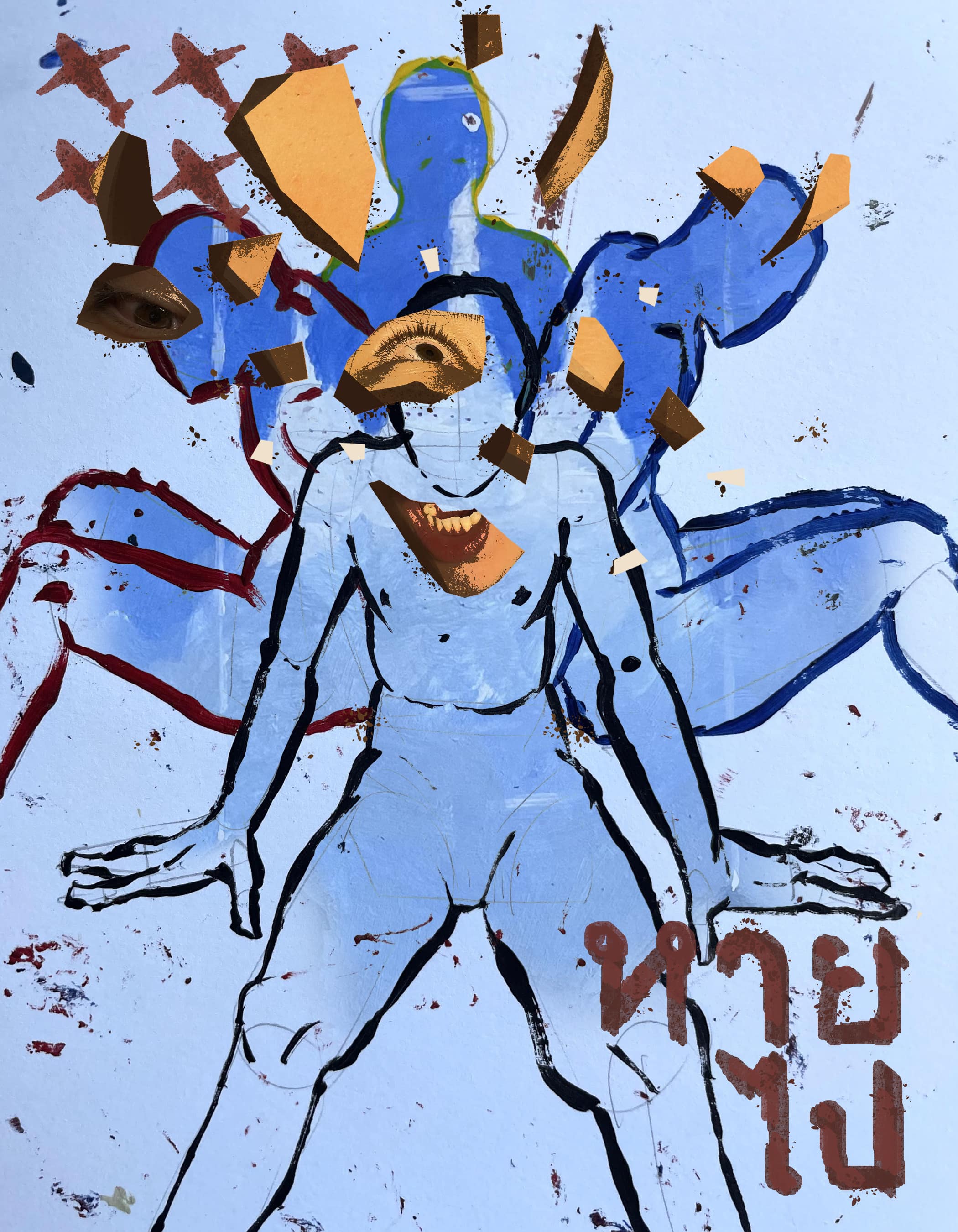
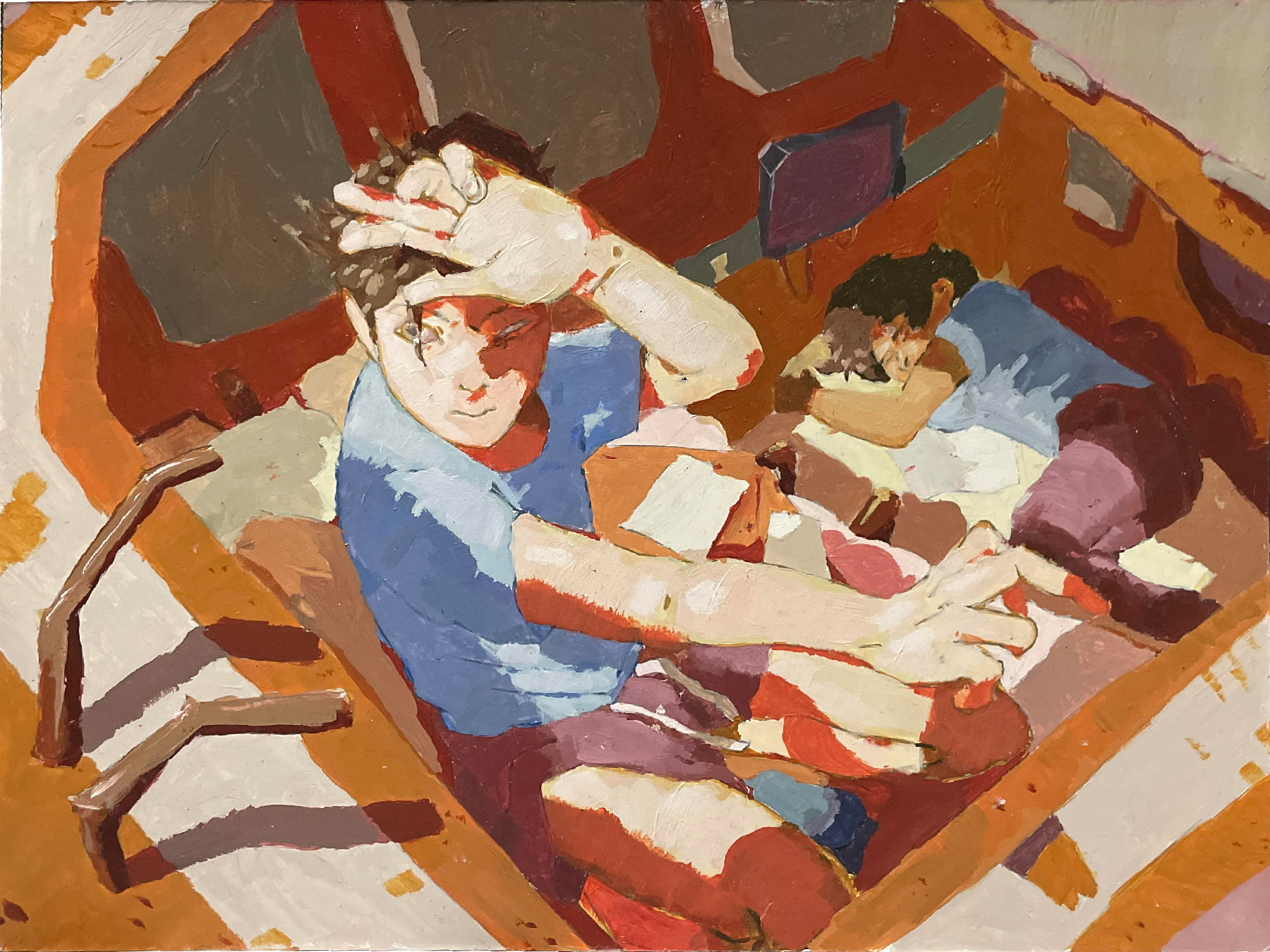
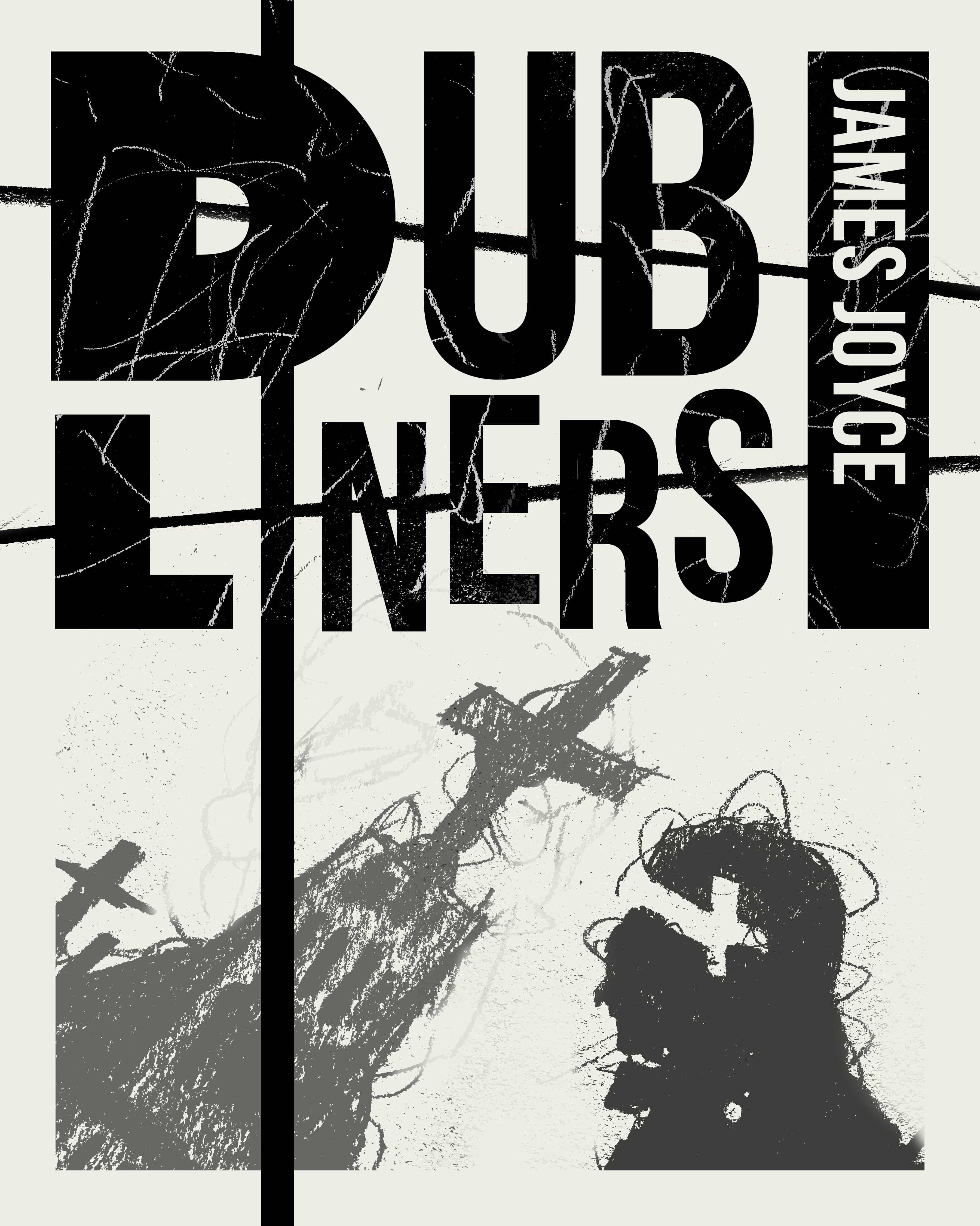
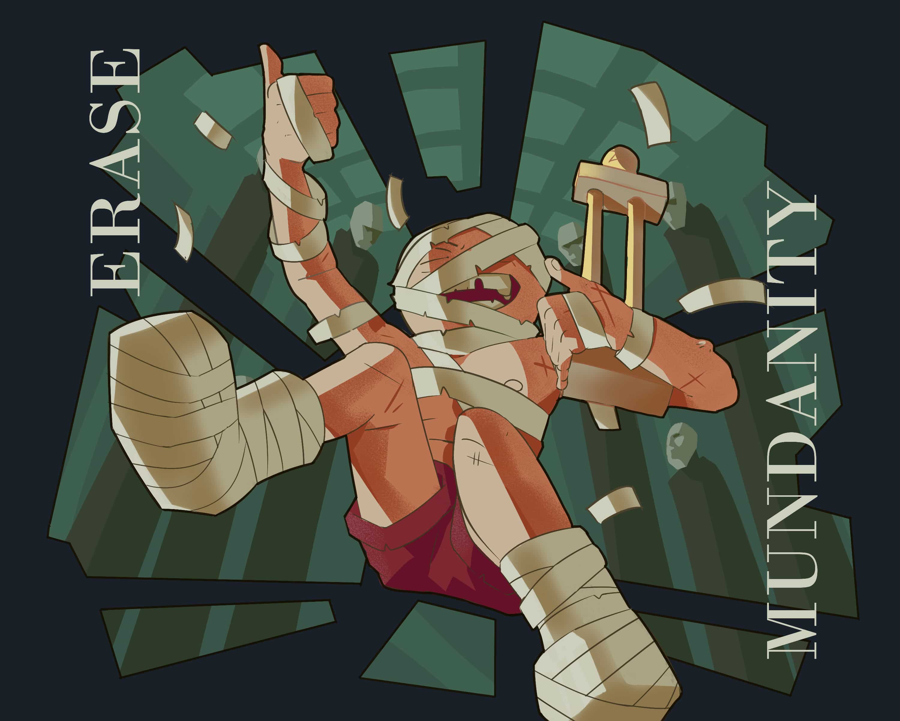
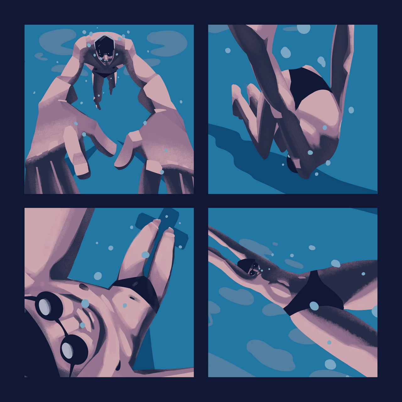
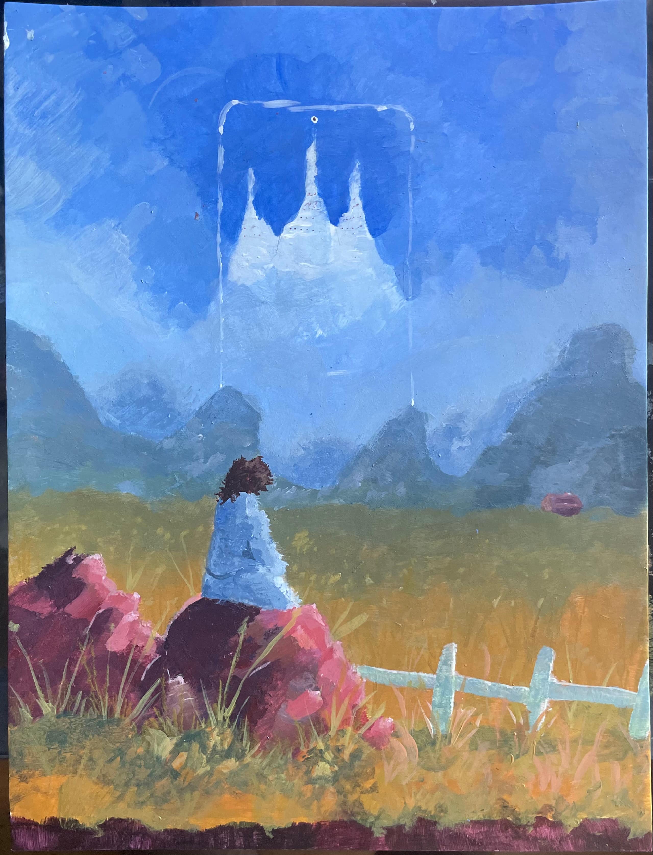
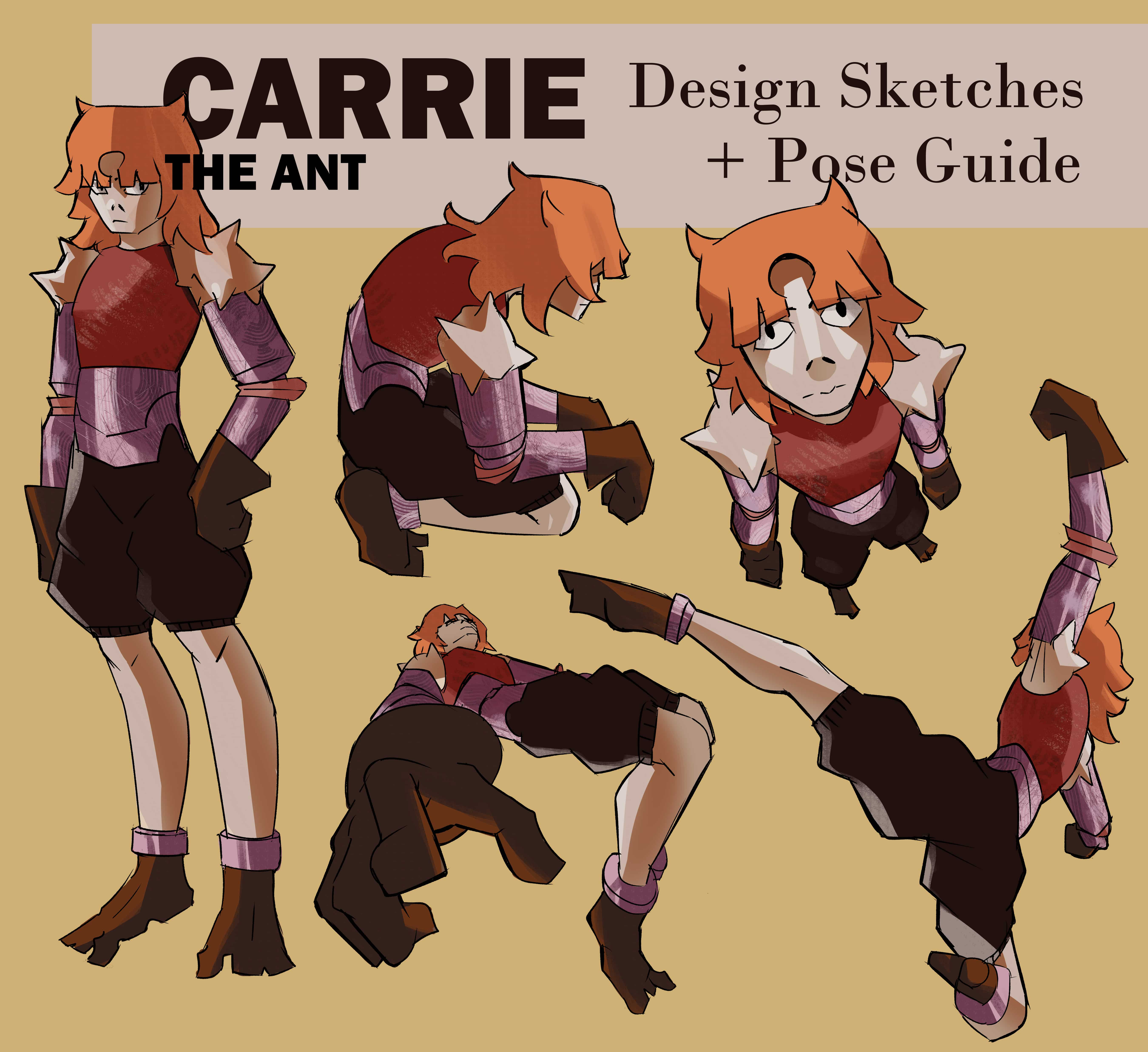
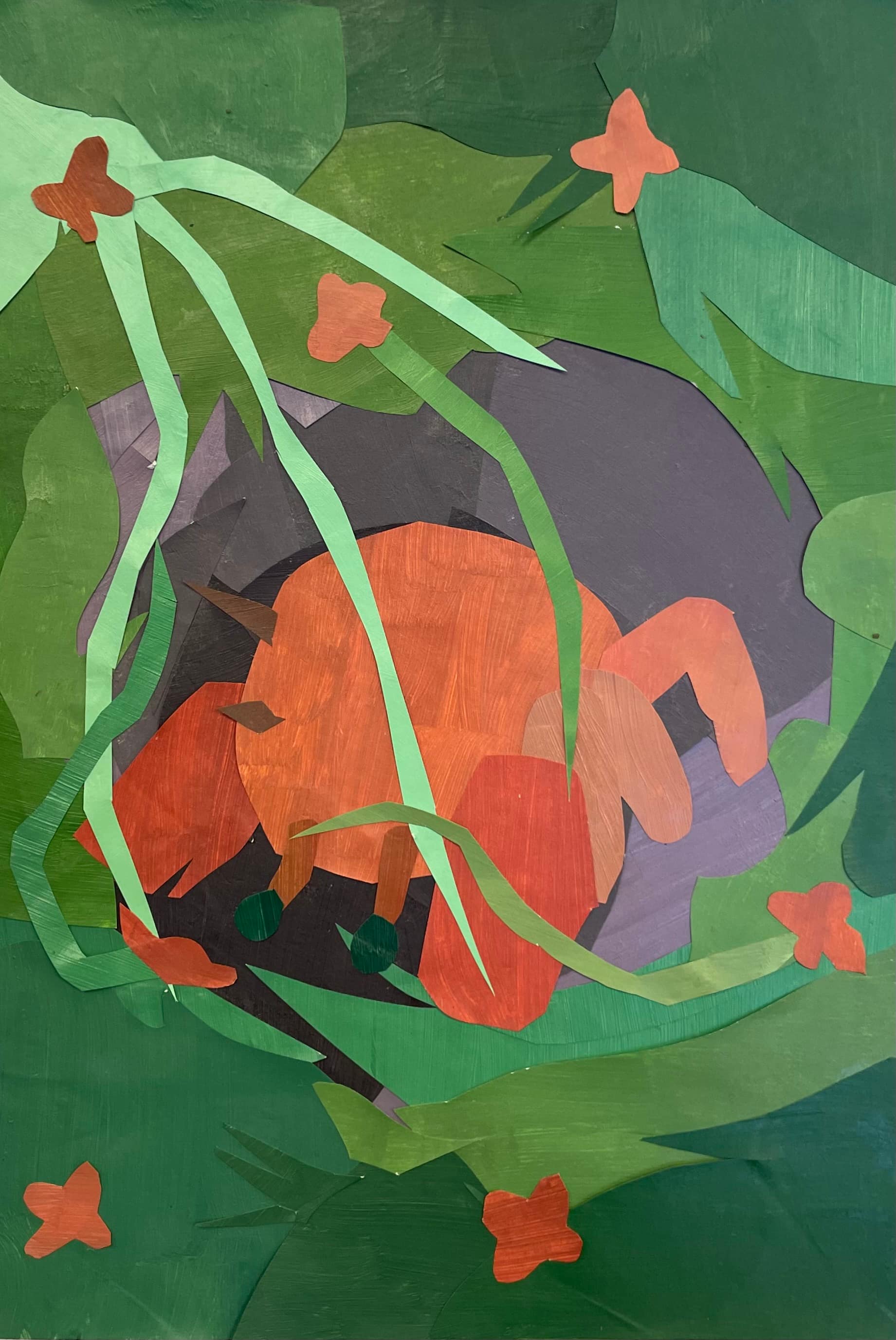
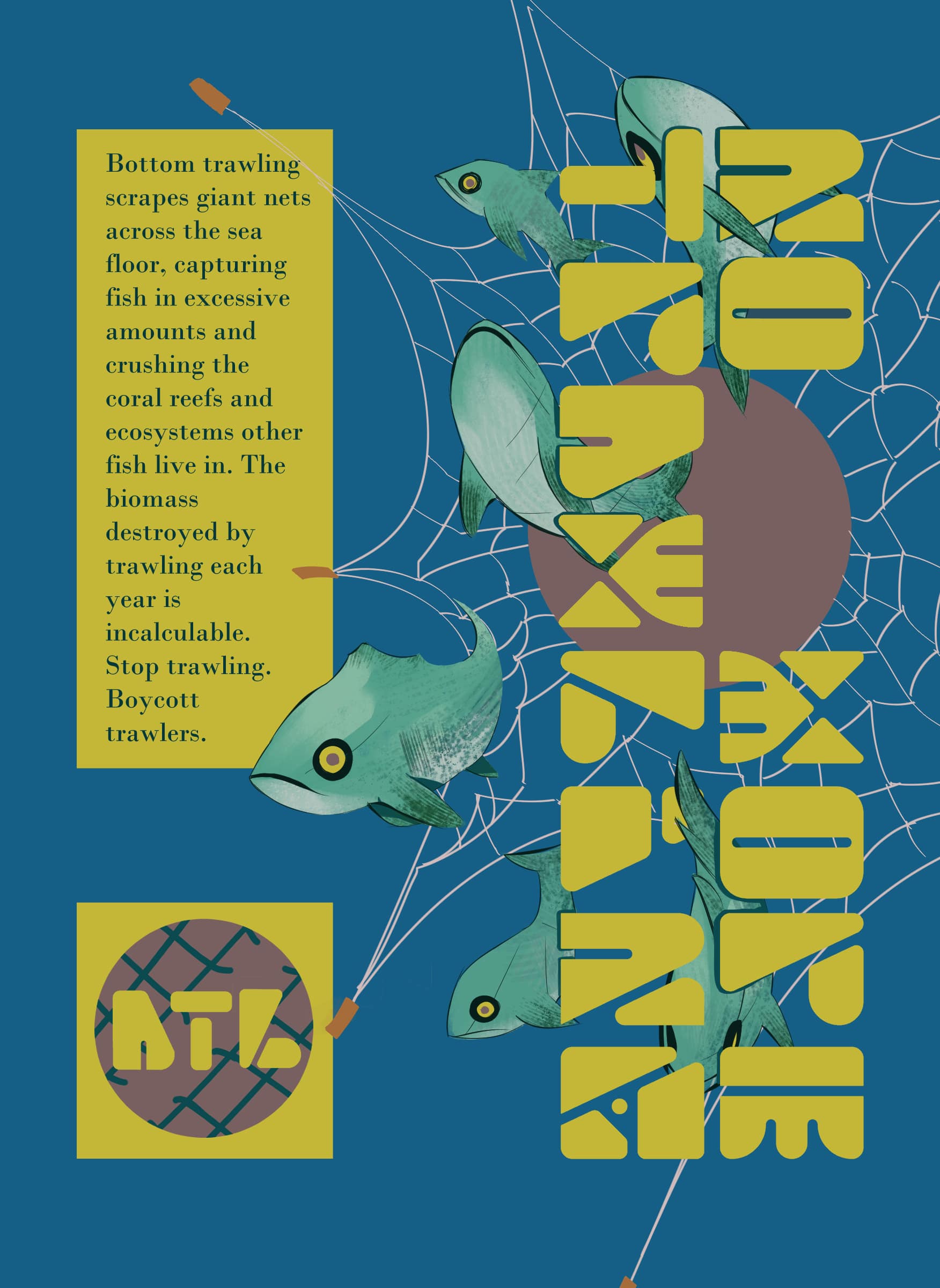
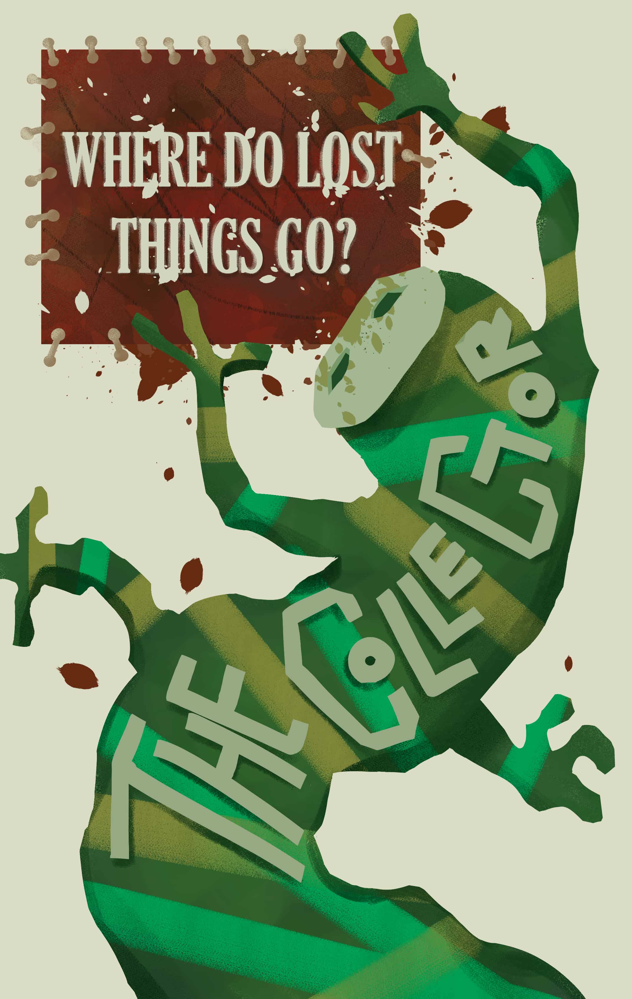
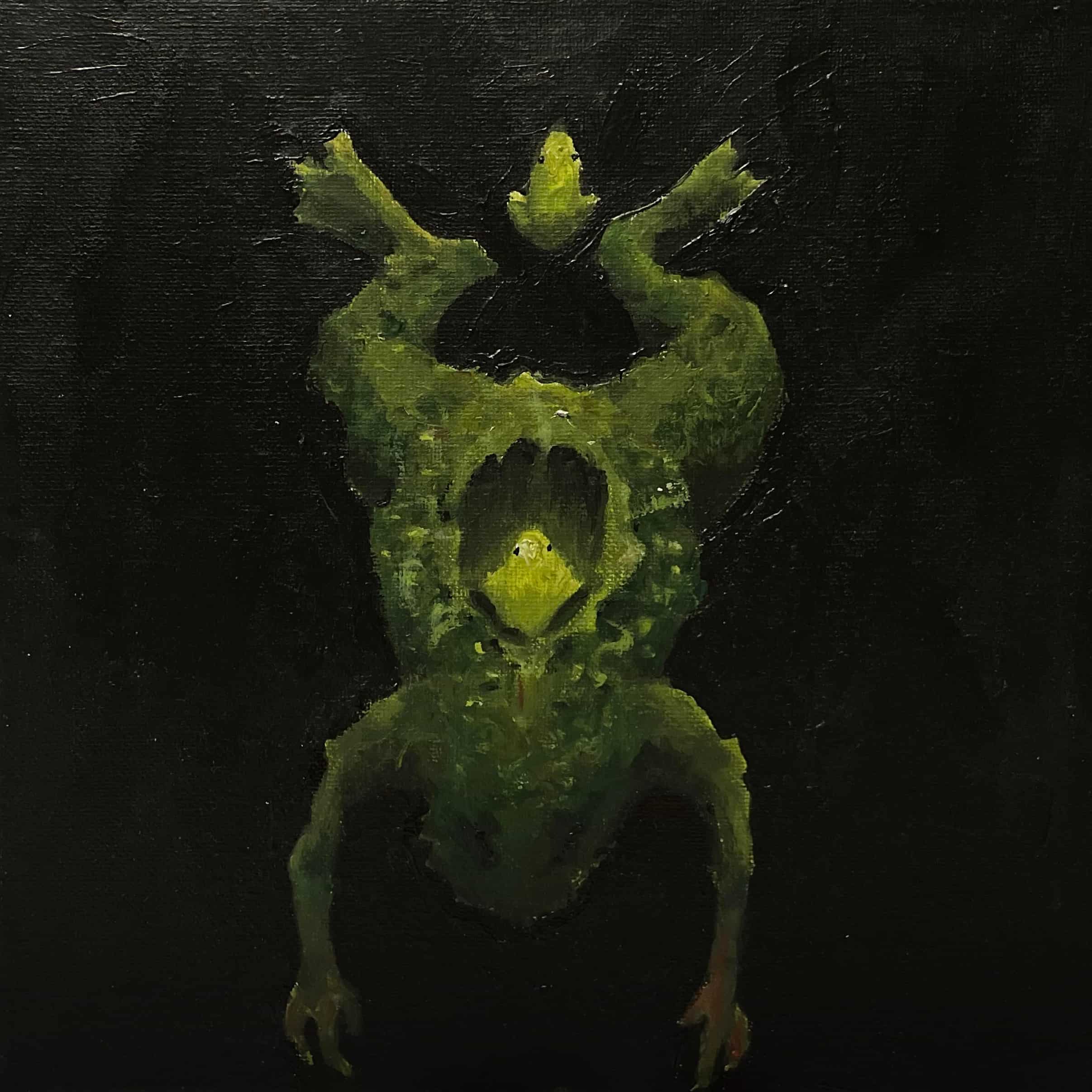
Here is a collection of pieces that I created before I transferred into UCLA's Design | Media Arts program. (Many of them were used in my application.) These works are more traditional and illustration-focused, preceding my recent work's shift to more computational and experience-focused spheres of design. This gallery includes paintings, character-focused art, and some early design work in the form of posters and book covers. My time spent making art and designing prior to transferring helped me hone my artistic fundamentals: balance, composition, colour, and hierarchy. My work has expanded into animation, fabrication, game-making, and 3D design, but the aesthetic skills I display in those projects were developed through work on these older pieces.
Here is a collection of pieces that I created before I transferred into UCLA's Design | Media Arts program. (Many of them were used in my application.) These works are more traditional and illustration-focused, preceding my recent work's shift to more computational and experience-focused spheres of design. This gallery includes paintings, character-focused art, and some early design work in the form of posters and book covers. My time spent making art and designing prior to transferring helped me hone my artistic fundamentals: balance, composition, colour, and hierarchy. My work has expanded into animation, fabrication, game-making, and 3D design, but the aesthetic skills I display in those projects were developed through work on these older pieces.
Personal Portfolio Website (Old Design). April 2026.
I designed my old portfolio site to showcase my creative and technical work, working on its information architecture, motion graphics, navigation system, and visual identity. For the visual look of my site, I wanted to pull from the darker aesthetics my work sometimes has with a tasteful navigation bar reminiscent of Puracane's 'I've Been Here The Longest' album cover. I balanced my aesthetic goals with fine-tuned margins and careful placement of my visual elements to make my site's hierarchy feel legible and engaging. Because I had never coded a project at this scale, I supplemented my coding workflow with AI, which helped me iterate on the site's JavaScript-powered animations while I learnt more about front-end development. This workflow helped me design my site's dynamic moving menu graphic where the letters spelling my creative pseudonym cycle through letterforms I constructed myself.
In addition to the aesthetic challenges of designing the site's UI, designing my site called for a lot of technical trouble-shooting. I took significant steps to reduce lag on my site, learning to host my media assets through Cloudflare and keeping my files adequately formatted and optimised. My time spent working on this website's old design helped me learn to make engaging UI, but also gave me the practical knowledge to design them more comfortably in the future.
I designed my old portfolio site to showcase my creative and technical work, working on its information architecture, motion graphics, navigation system, and visual identity. For the visual look of my site, I wanted to pull from the darker aesthetics my work sometimes has with a tasteful navigation bar reminiscent of Puracane's 'I've Been Here The Longest' album cover. I balanced my aesthetic goals with fine-tuned margins and careful placement of my visual elements to make my site's hierarchy feel legible and engaging. Because I had never coded a project at this scale, I supplemented my coding workflow with AI, which helped me iterate on the site's JavaScript-powered animations while I learnt more about front-end development. This workflow helped me design my site's dynamic moving menu graphic where the letters spelling my creative pseudonym cycle through letterforms I constructed myself.
In addition to the aesthetic challenges of designing the site's UI, designing my site called for a lot of technical trouble-shooting. I took significant steps to reduce lag on my site, learning to host my media assets through Cloudflare and keeping my files adequately formatted and optimised. My time spent working on this website's old design helped me learn to make engaging UI, but also gave me the practical knowledge to design them more comfortably in the future.
Graphics and Media for UCLA Radio. Winter 2025 - Spring 2026.
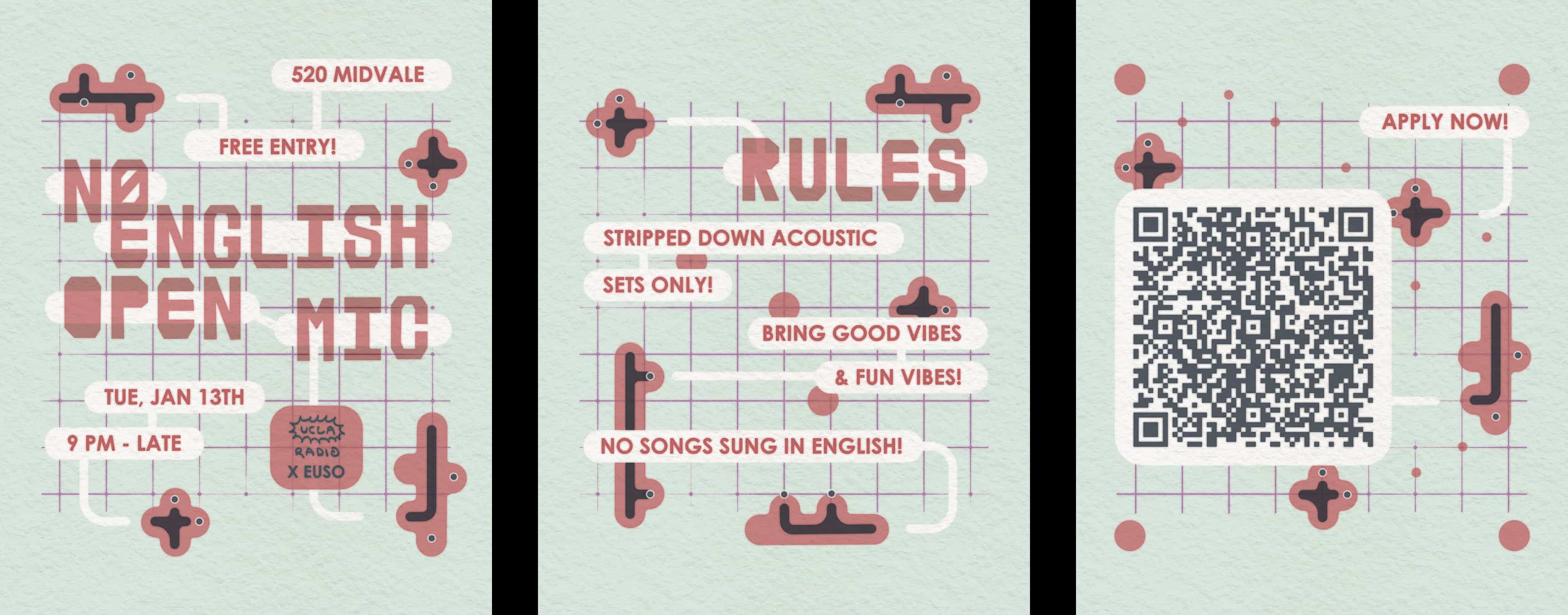
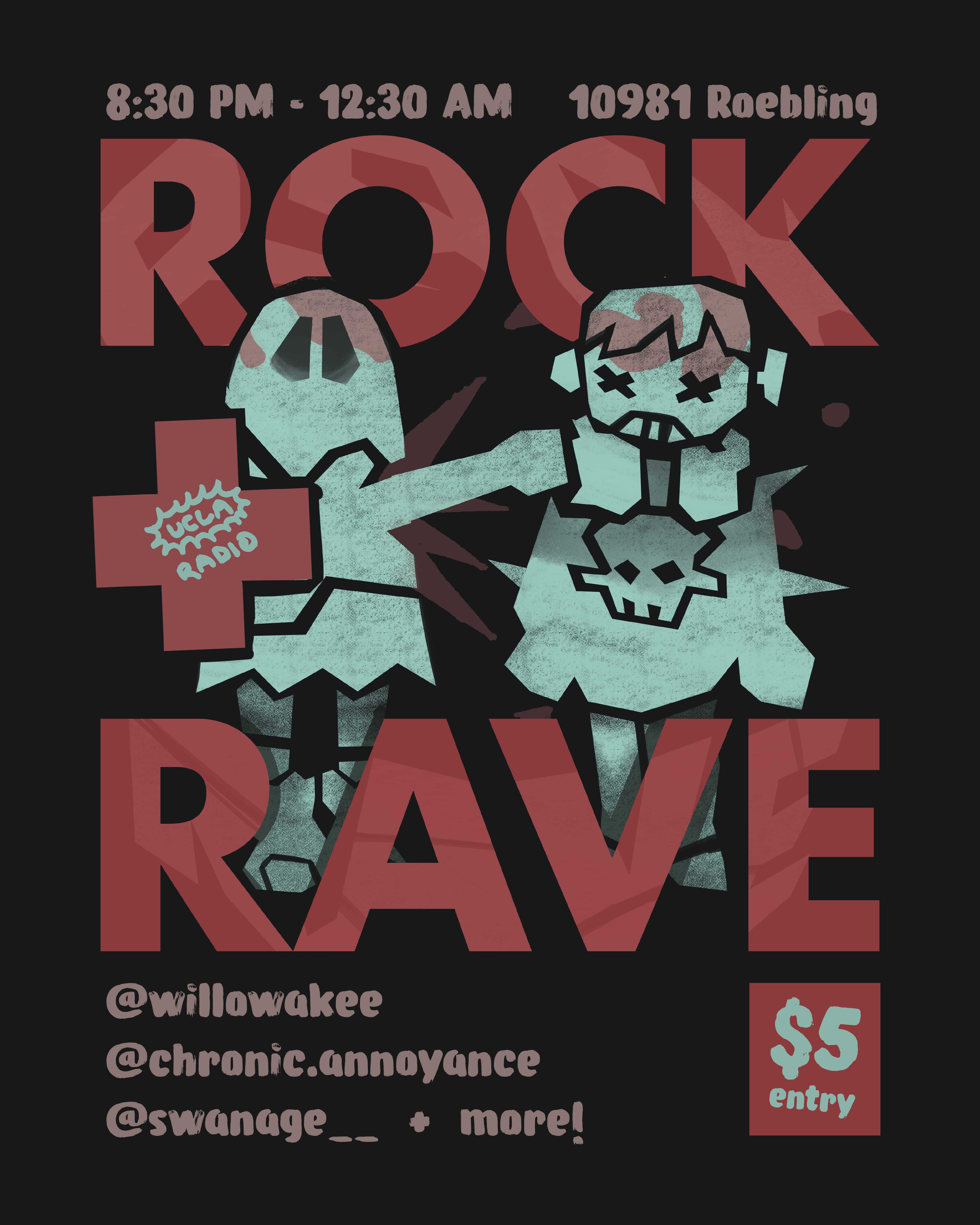
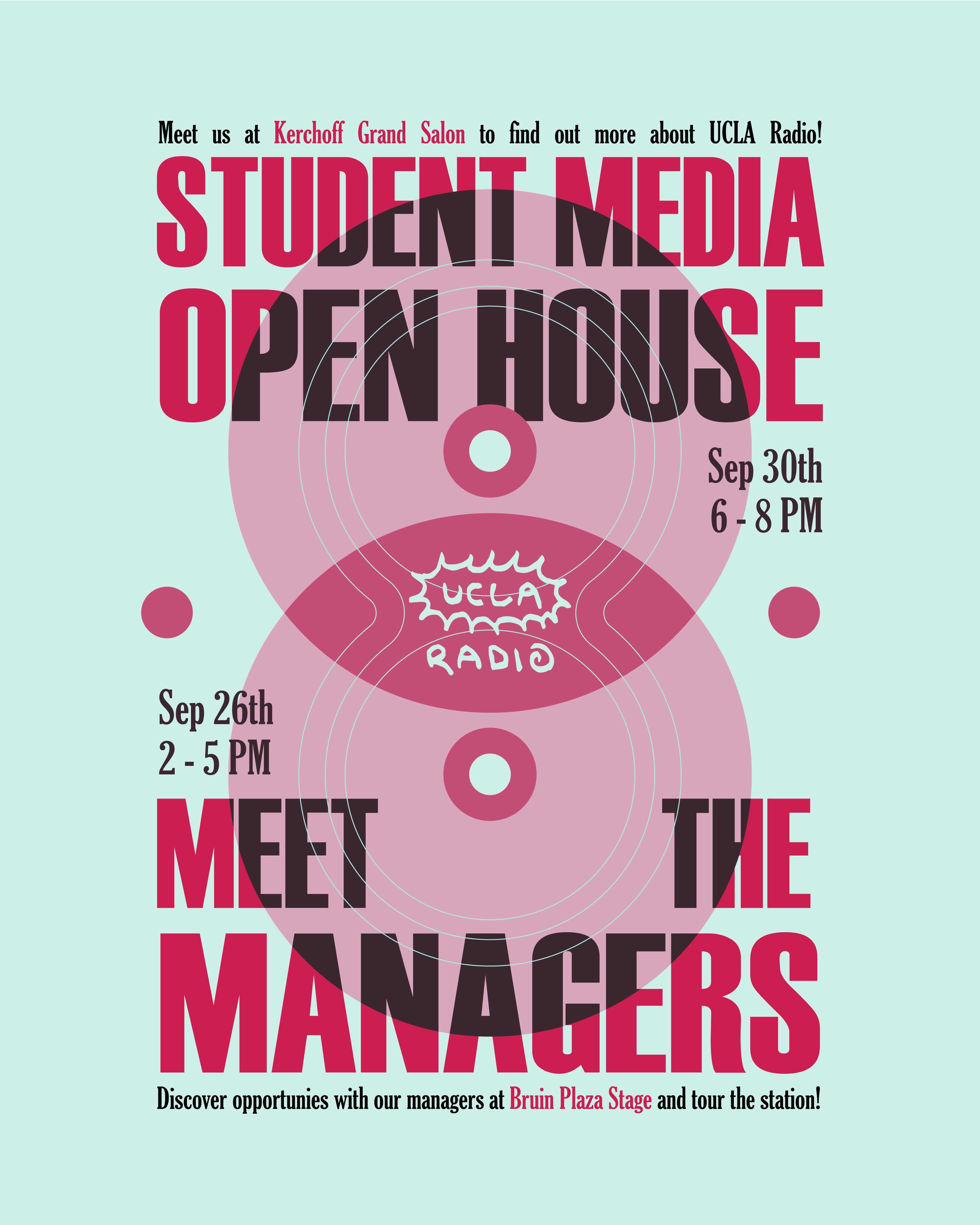
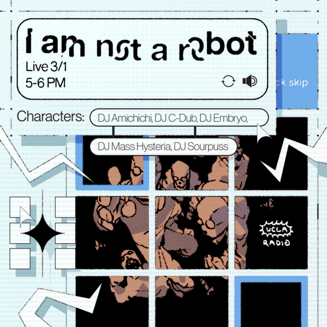
During my time as a UCLA Radio designer, I created a variety of graphic materials in line with the organisation’s DIY aesthetics, ranging from digital marketing assets to seasonal playlist covers. Working within a branding system that called for a sense of grunginess challenged me to combine the legible cleanliness of my design work with the expressive roughness of traditional illustration. Across a wide range of deliverables, I worked to adhere to UCLA Radio's visual identity while catering to each project's demands.
In addition to digital work, I helped create merchandise at in-person screen printing booths using screens with our department’s own custom designs. These experiences allowed me to work with both digital and physical mediums as I contributed to the organisation’s public-facing brand.
During my time as a UCLA Radio designer, I created a variety of graphic materials in line with the organisation’s DIY aesthetics, ranging from digital marketing assets to seasonal playlist covers. Working within a branding system that called for a sense of grunginess challenged me to combine the legible cleanliness of my design work with the expressive roughness of traditional illustration. Across a wide range of deliverables, I worked to adhere to UCLA Radio's visual identity while catering to each project's demands.
In addition to digital work, I helped create merchandise at in-person screen printing booths using screens with our department’s own custom designs. These experiences allowed me to work with both digital and physical mediums as I contributed to the organisation’s public-facing brand.
2024 Sierra Journal. June 2024.
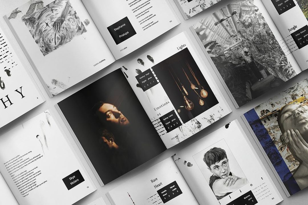
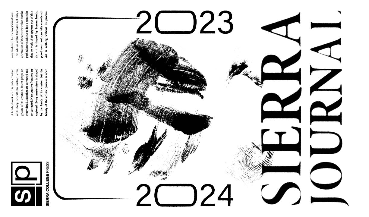
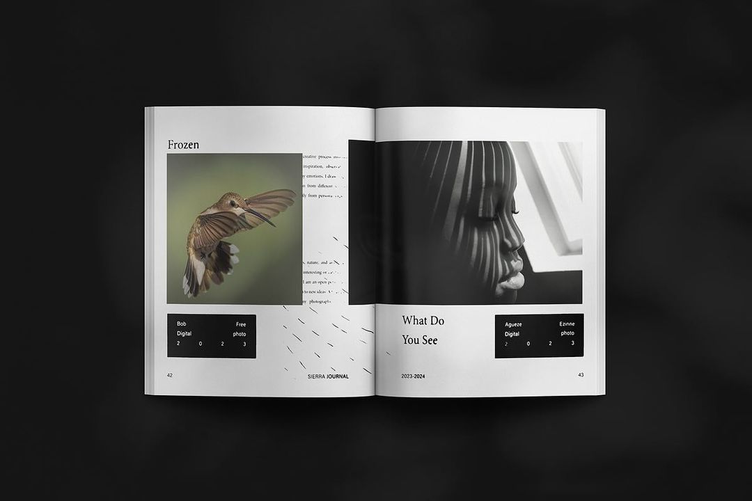
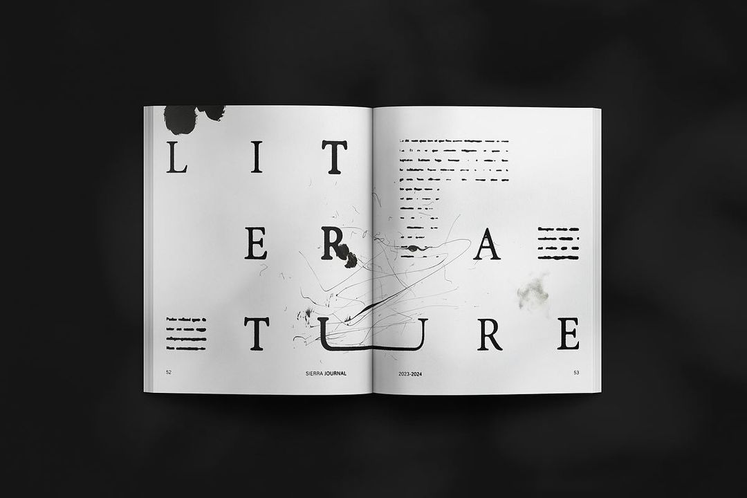
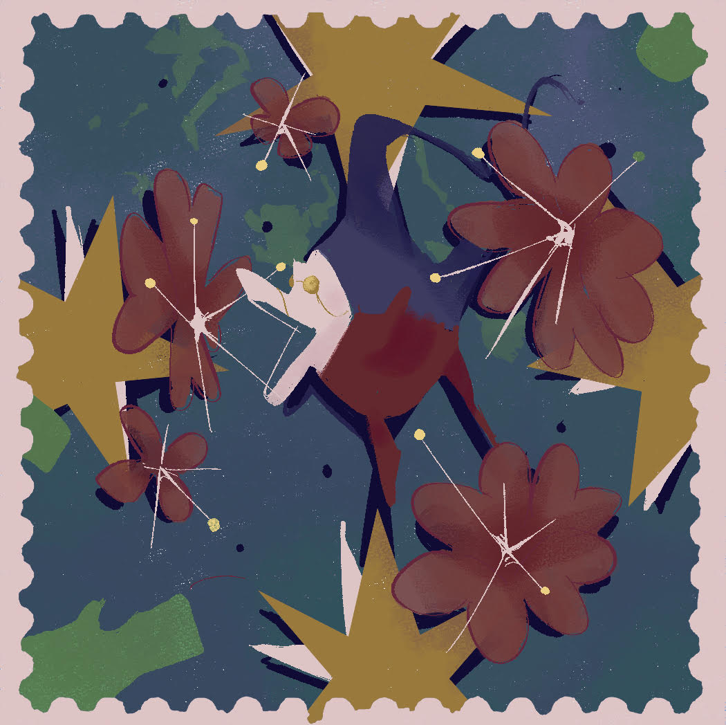
During my time at Sierra College, I was chosen by the board of directors overseeing the production of the Sierra Journal, the college’s annual art and literary magazine, to art-direct its 2024 edition. As art director, I developed that edition of the journal’s theme and aesthetic identity. During the initial layout stages, I designed the layouts for each page with rulesets for alteration that the designers working under me could follow. Once they filled in the pages I had formatted with students’ art and poetry, I fine-tuned the composition of every one of the journal’s 160 pages, making sure every page felt unified and in line with the journal’s themes. Having to refine the journal and work with massive InDesign documents in a relatively short time frame was daunting, but the finished journal was a success. The final publication was awarded "Most Outstanding Community College Literary Magazine" by the American Scholastic Press Association and a "Superior Ranking" from the National Council of Teachers of English (NCTE).
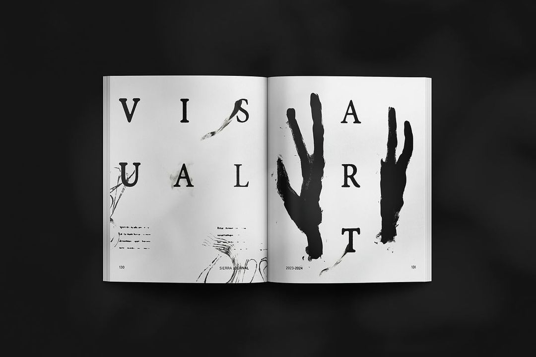
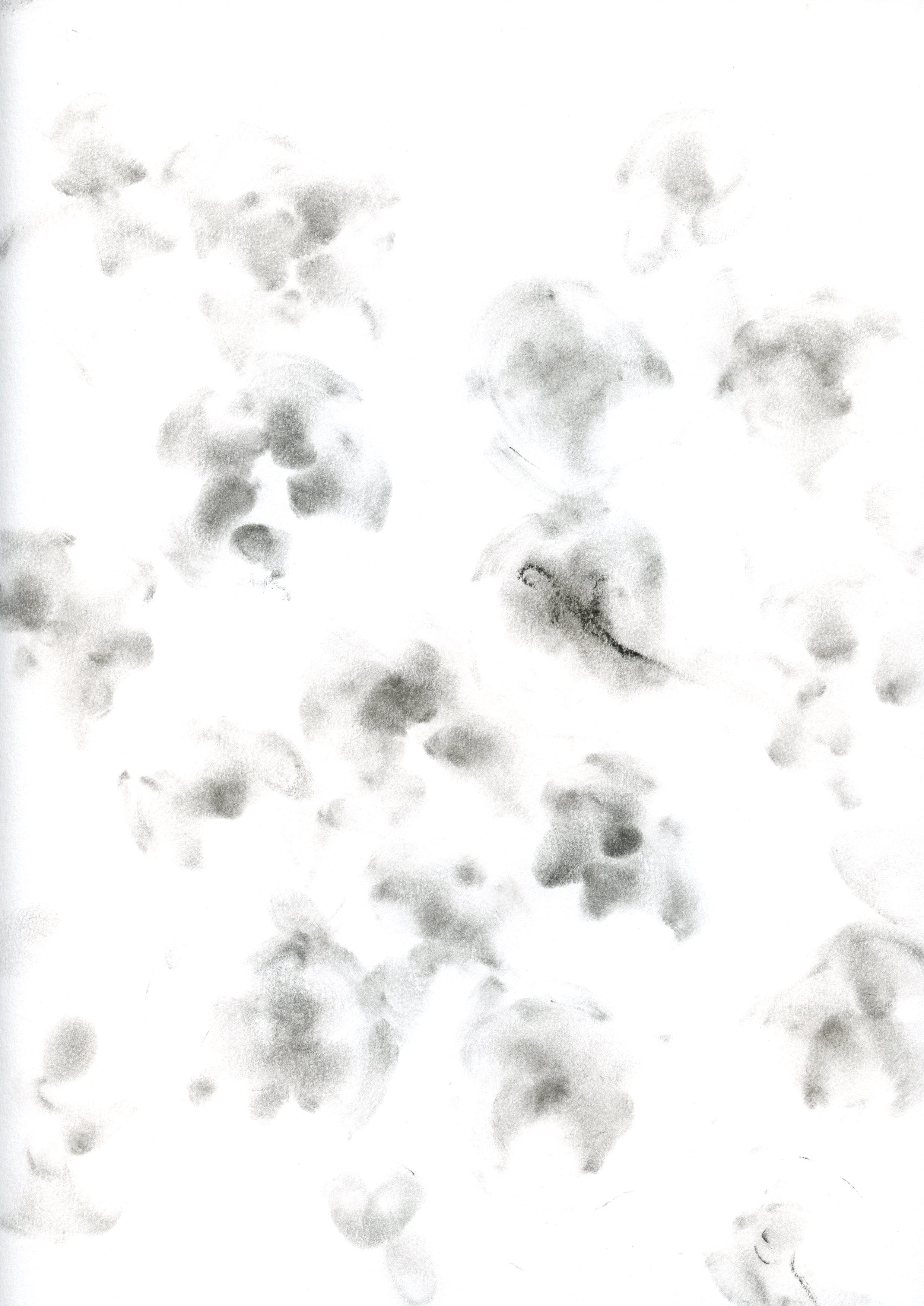
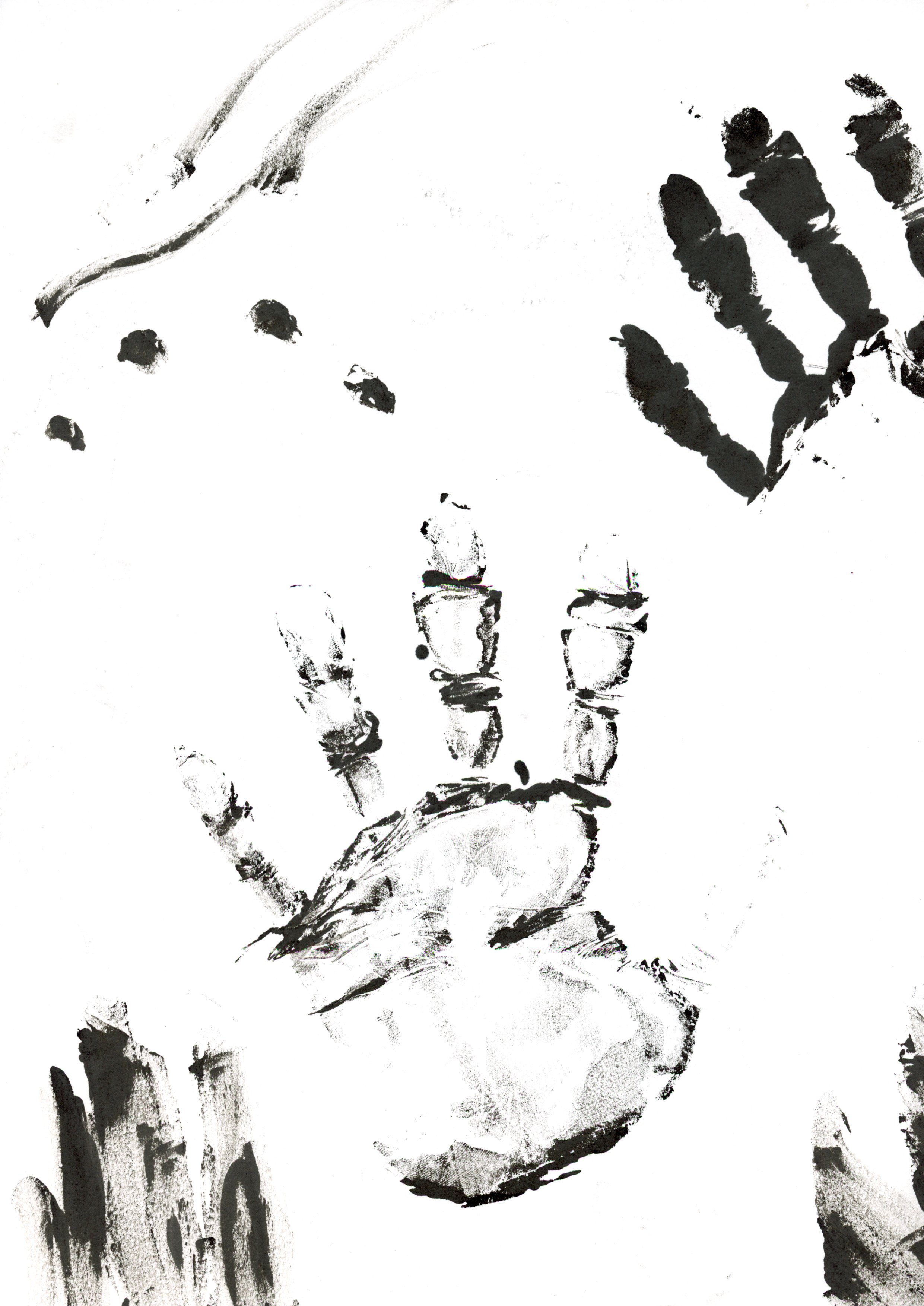
The theme I pitched for the journal was “Hand of the Creator” - I felt minimalist design trends often downplayed the importance of the artistic process, so I wanted to push back and design something with a little more grit and a sense of being handmade. My illustration team helped me produce and scan in countless artistic marks like inkbleeds and pencil marks for us to incorporate throughout the book. These custom textures helped us give each page a distinct handmade character without distracting from the layout.
Learn more about the 2024 edition of the Sierra Journal here.
During my time at Sierra College, I was chosen by the board of directors overseeing the production of the Sierra Journal, the college’s annual art and literary magazine, to art-direct its 2024 edition. As art director, I developed that edition of the journal’s theme and aesthetic identity. During the initial layout stages, I designed the layouts for each page with rulesets for alteration that the designers working under me could follow. Once they filled in the pages I had formatted with students’ art and poetry, I fine-tuned the composition of every one of the journal’s 160 pages, making sure every page felt unified and in line with the journal’s themes. Having to refine the journal and work with massive InDesign documents in a relatively short time frame was daunting, but the finished journal was a success. The final publication was awarded "Most Outstanding Community College Literary Magazine" by the American Scholastic Press Association and a "Superior Ranking" from the National Council of Teachers of English (NCTE).
The theme I pitched for the journal was “Hand of the Creator” - I felt minimalist design trends often downplayed the importance of the artistic process, so I wanted to push back and design something with a little more grit and a sense of being handmade. My illustration team helped me produce and scan in countless artistic marks like inkbleeds and pencil marks for us to incorporate throughout the book. These custom textures helped us give each page a distinct handmade character without distracting from the layout.
Learn more about the 2024 edition of the Sierra Journal here.